Copyright: Dieter Asmus,Fair Use
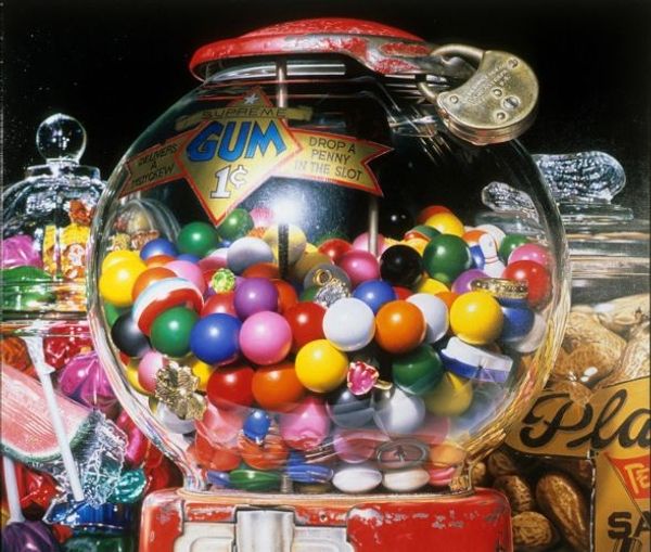
Curator: Here we have Dieter Asmus' "Vitaminbombe," created in 1976. It's a striking example of graphic art, showcasing elements of Pop and Conceptual art prevalent during the Modernist era. Editor: Whoa, it's like a confetti explosion in pill form! Gives you this slightly unsettling but also vibrant, almost playful feeling, like a health scare turned party favor. Is that the intention, I wonder? Curator: The visual dynamic certainly leans into that tension. Observe how the composition is constructed. The artist uses a very deliberate arrangement of forms to create a sense of visual overload, amplified by the almost hyper-realistic rendering of the capsules. Editor: Right, that precision is key! It's almost surgically clean, which juxtaposes nicely against the chaotic spread of the colourful vitamins. Almost makes you think of the control and randomness we wrestle with when it comes to our health. The colour balance – does that speak to any kind of theory in art? Curator: The color palette plays a crucial role here. The strategic placement of the colours create internal contrasts and unifies the image with the conceptual content. Editor: A Vitamin BOMB, that's very literal but, looking at it now, is it an explosion of health or is it speaking to the possible dependence that’s creeping into our everyday existence through a reliance on pharmaceuticals. Food for thought there... Curator: Indeed. This image functions as both a mirror and a critique, holding a space where our health obsessions, as well as art, find room to be questioned and challenged. Editor: Absolutely. It’s impressive how much depth you can pack into a single, shiny graphic. Thanks for the enlightening deep dive. Curator: It's the marriage of style, technique, and social context that truly defines its impact. Thank you.
Comments
No comments
Be the first to comment and join the conversation on the ultimate creative platform.
More like this