Copyright: Kishio Suga,Fair Use
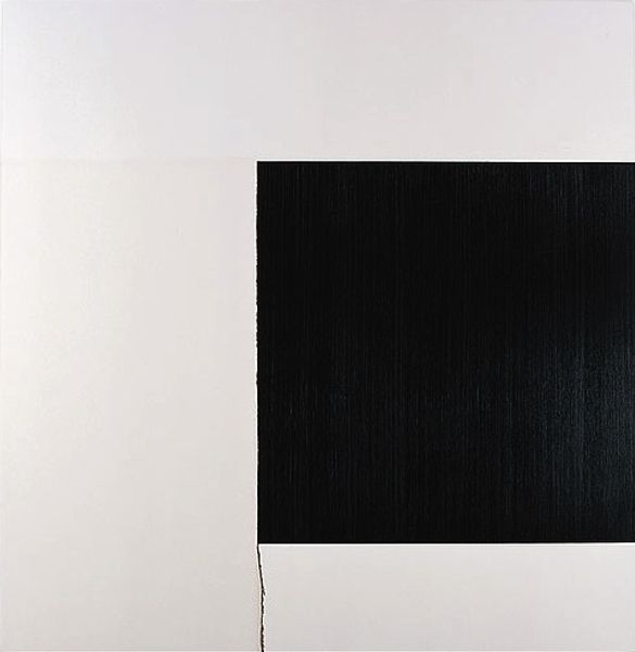
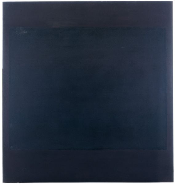
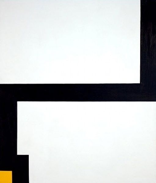
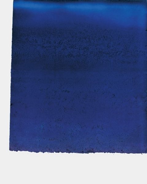
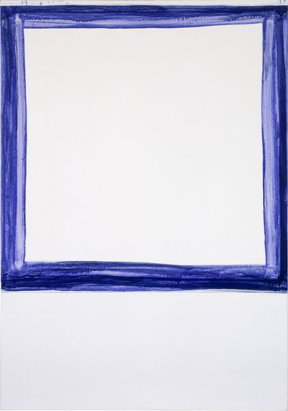
Editor: Here we have Kishio Suga’s “Wrapped and Differed Space” from 1975, created using mixed media. The simple composition with geometric shapes generates a very formal, quiet sensation. What can you tell us about this piece? Curator: This work exemplifies the reductive tendencies within hard-edge painting. Notice how Suga employs basic geometric forms, the rectangles. Focus on their precise arrangement on the canvas, and how their interaction generates a sense of spatial tension. What effect do you think is achieved with the limited color palette? Editor: The high contrast between the black background, the white rectangle and dark lines makes the image very stark. The composition isn’t exactly balanced, since the upper rectangle is a dark bar. Curator: Exactly. It's crucial to note that this asymmetry disrupts any conventional sense of harmony. Consider also the surface texture. Are the lines perfectly uniform, or do you detect subtle variations in their application? How do these variations contribute to the overall impact of the artwork? Editor: Now that you mention it, the lines definitely aren’t perfect. They look a bit…scratchy? The white one especially. That seems deliberate, maybe to disrupt the pure geometry. Curator: Precisely. It introduces an element of the artist's hand, preventing the work from becoming purely conceptual. This subtle interplay between precision and imperfection is central to its formal strength. Editor: That makes sense. I was so caught up in the shapes that I almost missed the importance of the surface and the way the paint was applied. Thanks for pointing that out! Curator: Indeed. Paying close attention to the intrinsic elements opens up ways for interpreting art.
Comments
No comments
Be the first to comment and join the conversation on the ultimate creative platform.
More like this