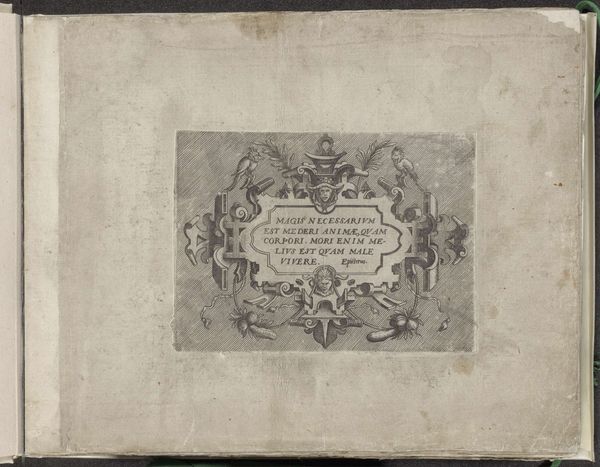
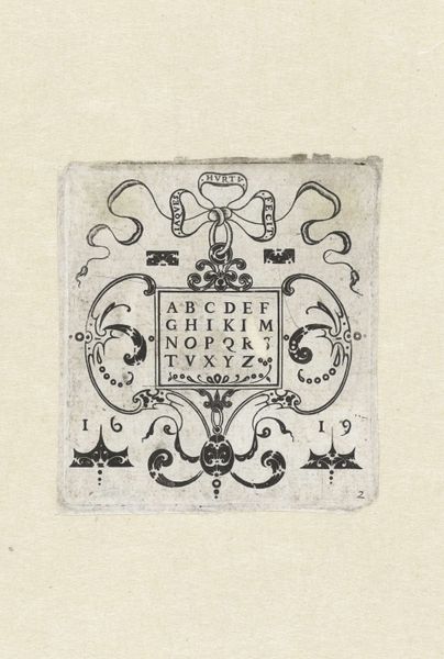
drawing, print, paper, ink, engraving
#
drawing
#
aged paper
#
toned paper
#
light pencil work
# print
#
old engraving style
#
paper
#
11_renaissance
#
personal sketchbook
#
ink
#
fading type
#
northern-renaissance
#
sketchbook art
#
engraving
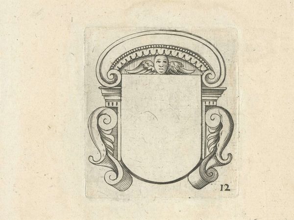
Dimensions: height 48 mm, width 60 mm, height 195 mm, width 165 mm
Copyright: Rijks Museum: Open Domain
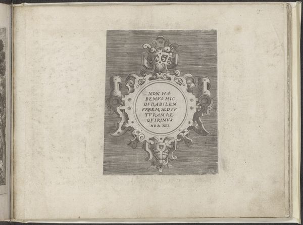
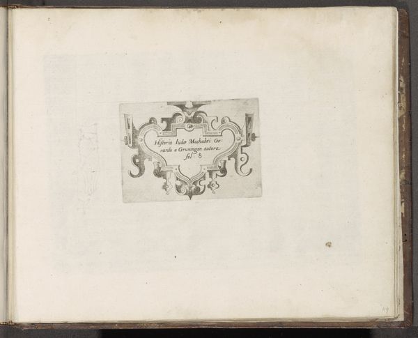
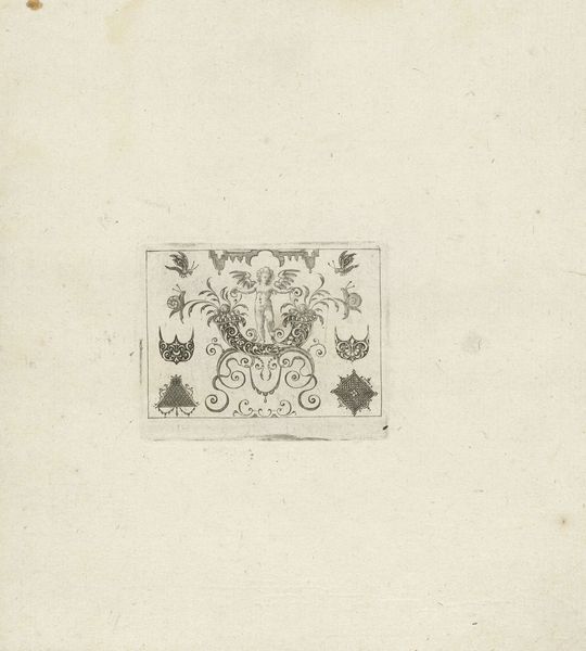
Curator: Well, look at this curious little thing! A 1596 engraving titled "Alfabet in vierpas in een omlijsting met grotesken" by Monogrammist SB. Editor: My first impression is a sense of intricate order within delicate lines, yet it feels unfinished, like a preliminary study for something grander. Curator: Precisely! The "grotesques," those fantastical hybrid creatures adorning the frame, were all the rage then. But notice the alphabet centered in the composition; this wasn't mere decoration. This likely served as a model for artisans, perhaps embroiderers or metalworkers, showcasing patterns and lettering styles. Editor: You can see the aging process within the very texture of the paper and the faded inks. Notice the visual weight is distributed symmetrically around the central cartouche containing the alphabet. What effect do you think it was intended to create for the viewer? Curator: Ah, excellent observation. Symmetry would signal balance and order – key humanist values during the Renaissance, aligning practicality and elegance. These models empowered craftspeople to reproduce sophisticated designs. Editor: I am interested in the material realities for the monogrammist. Given its medium and form, was the print intended as art or for industrial use in producing art or craft? Does its utility undermine its place as high art? Curator: You raise a central tension within Renaissance art! Prints occupied a unique space bridging art and craft production. Mass dissemination was its aim and its means, effectively democratizing access to design in ways previously unimaginable. Editor: This prompts considerations about the function of artistic production itself, doesn't it? How materials shaped the means of production but are also imbued with artistic decisions and creative exploration. The lines are increasingly blurred when we bring into focus the realities of the artistic labour involved. Curator: Yes, in essence, these printed alphabets enabled the "branding" of Renaissance design! A perfect melding of art and practical utility. It demonstrates a key aspect of design's functionality within a larger context of social relations. Editor: In conclusion, what appears to be a simple page reveals intricate dynamics between artistic ingenuity and the practicalities of craft production. Curator: Exactly! It serves as a fascinating testament to the fusion of form, function, and the industrious spirit of the Renaissance.
Comments
No comments
Be the first to comment and join the conversation on the ultimate creative platform.
More like this