drawing, graphic-art, print, paper, typography, ink
#
drawing
#
graphic-art
#
art-nouveau
# print
#
pen sketch
#
book
#
paper
#
typography
#
ink
#
pen-ink sketch
#
pen work
#
decorative-art
Dimensions: height 153 mm, width 120 mm
Copyright: Rijks Museum: Open Domain
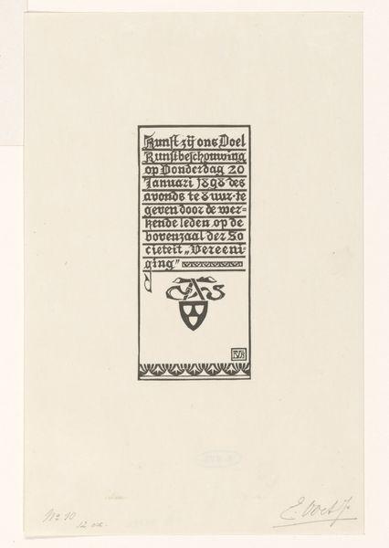
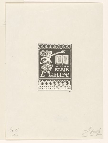
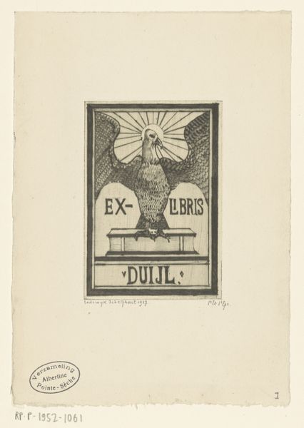
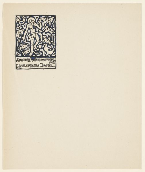
Curator: Looking at this delicate graphic piece, one feels immediately transported to another era, no? Editor: Indeed. It's incredibly intimate; almost feels like a secret whispered onto the page. I like the strong Art Nouveau feel with such a tight composition. What exactly are we looking at? Curator: This is an "Ex Libris van Wim Voet," dating roughly between 1878 and 1940. It's a bookplate design, intended to be pasted inside the cover of a book to indicate ownership, created in ink and print. Editor: The "Ex Libris"—that's Latin for "from the books," right? It's more than just a name, isn’t it? The design itself speaks volumes. What's with the 'W' with wings in the center? Curator: Precisely. Bookplates became miniature artworks in their own right. The stylized "W" is likely a monogram for Wim Voet, the book owner. Those wings could symbolize intellect or aspiration. Notice how the image sits above a stylized shelf of books as a base, reinforcing its role of ownership and collection. The books as foundations for ideas and a life of the mind. Editor: There is also something vaguely heraldic about the way the monogram with the wings are laid out—perhaps echoing a family crest, but modernized. It almost feels like a personal emblem; not just for the book but also a personal statement. How was something like this even produced? Curator: It would have been printed, most likely using a technique like etching or engraving, allowing for detailed linework and the production of multiple copies, so Wim Voet could adorn all his beloved books! It served a functional purpose but shows artistic refinement. Editor: Makes me wonder about Wim Voet's book collection, and what it said about him. Did he commission this design, or was it a gift? I am also struck by how the seemingly simple design hints at so much beneath the surface. A dialogue with a personal world. Curator: Questions indeed that deepen the mystique. As for the artistic choices behind this specific piece and similar pieces of the time— it certainly embodies a turn-of-the-century desire to personalize and elevate everyday objects into small tokens of individual expression, wouldn't you say? Editor: Absolutely. Something so small, yet teeming with personality and aspiration, designed to reside within the private realm of a book. That says a lot about the values that were around back then and continue to echo even now.
Comments
No comments
Be the first to comment and join the conversation on the ultimate creative platform.
More like this