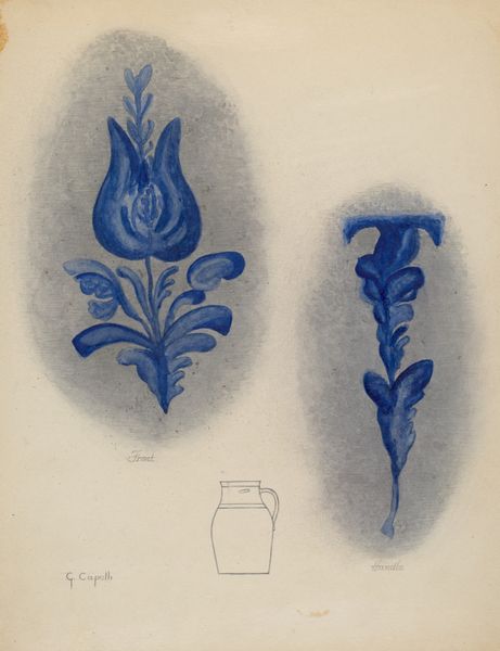
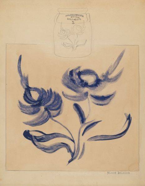
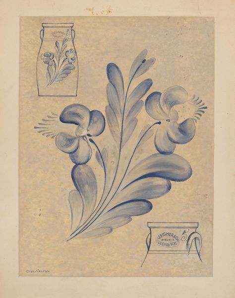
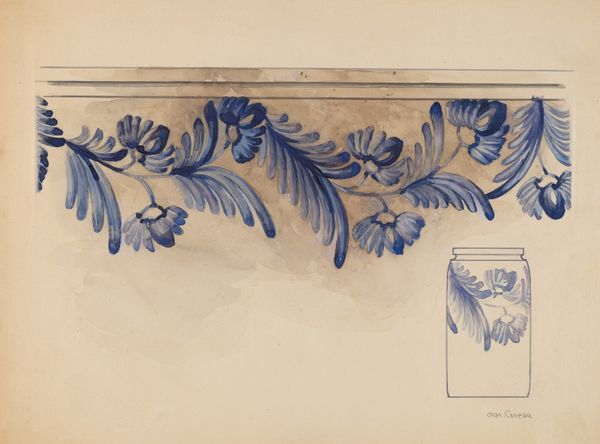
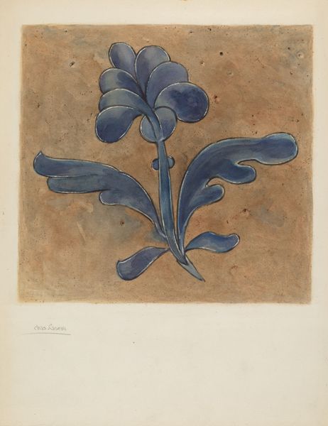
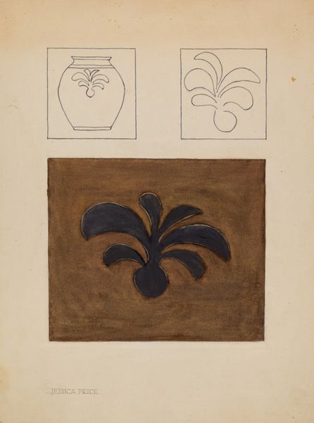
drawing, painting, watercolor
drawing
painting
watercolor
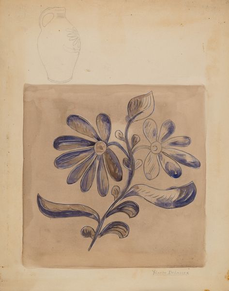
watercolour illustration
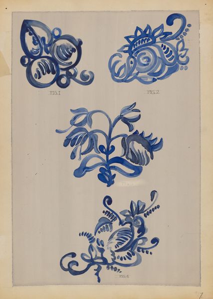
watercolor
Dimensions: overall: 28 x 23.1 cm (11 x 9 1/8 in.)
Copyright: National Gallery of Art: CC0 1.0
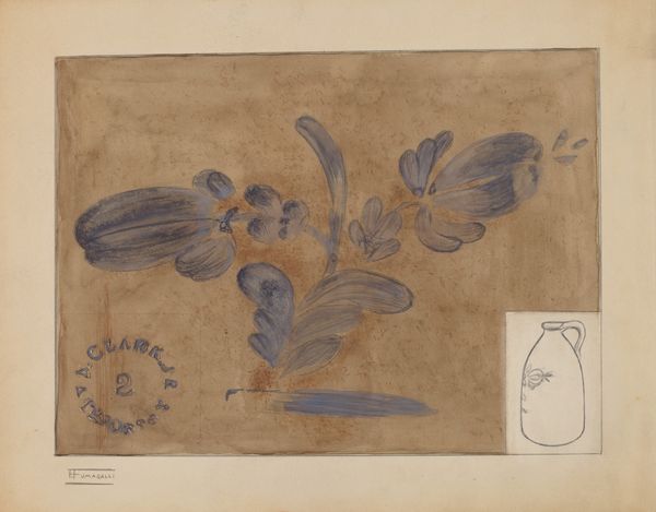
Curator: Welcome to our exhibit. Today, we'll be examining Hedwig Emanuel's "Design," a watercolor and drawing piece created between 1935 and 1942. Editor: What strikes me immediately is its simplicity and use of the watercolor medium. It is also intriguing how two potential sides of an object are arranged. What do you see in this piece through the lens of formalism? Curator: Intriguing observation. Let us first appreciate the structural interplay of forms. Notice the central verticality established by the larger floral motif labeled "front," contrasted with the attenuated floral form representing the "handle." The color palette is remarkably constrained, a near monochrome of blues and greys. How do these limited colors contribute to the overall effect? Editor: I find they evoke a sense of cool tranquility, emphasizing the design elements over vibrant realism. It makes me think about the artist using specific shapes with the colors as their complement. Would that be right? Curator: Precisely. The flatness of the watercolor application also demands attention. Observe how Emanuel avoids chiaroscuro, favoring planar representation. This choice accentuates the design's graphic quality, blurring the lines between fine art and functional design. Where does the 'functional design' seem relevant? Editor: The reference to ‘handle’ would suggest this might be a design for ceramics, or possibly textiles with that simple colour scheme, like for clothing items. Curator: That brings up important questions. Consider now the arrangement: The calculated asymmetry creates a dynamic tension. The composition isn't merely decorative; it establishes a visual hierarchy that guides the viewer's eye. This tension between symmetry and asymmetry is palpable, isn’t it? What compositional choices support or challenge this dynamic tension, in your opinion? Editor: Now I see what you mean; the title hints towards intentional asymmetry on each component of design. It is not the type of aesthetic composition with the central design, rather, they interplay with one another, challenging our expectation for balance. Curator: Precisely! The exploration of structure through colour and form is compelling. It urges the viewers to understand the design process and notice that aesthetic pleasure resides in this formal inquiry itself. Editor: Fascinating. This has really helped me appreciate the work on a totally new plane, it can tell you something. Thank you for walking me through Hedwig's use of structural relationships here.
Comments
No comments
Be the first to comment and join the conversation on the ultimate creative platform.