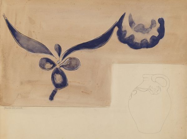
drawing, mixed-media, paper, ink
drawing
mixed-media
paper
ink
geometric
watercolor
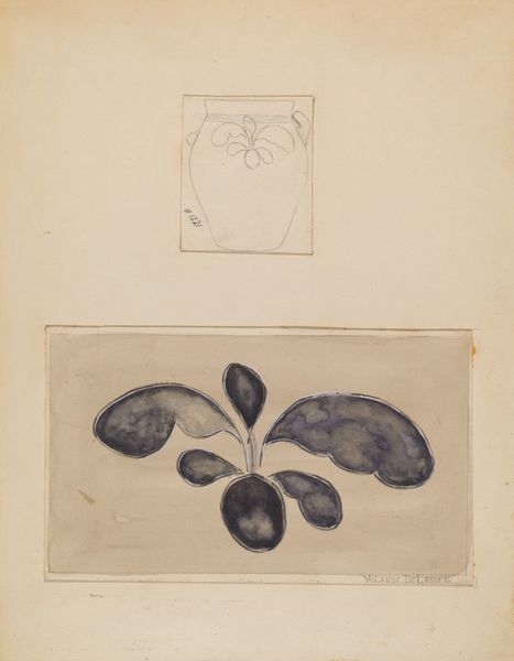
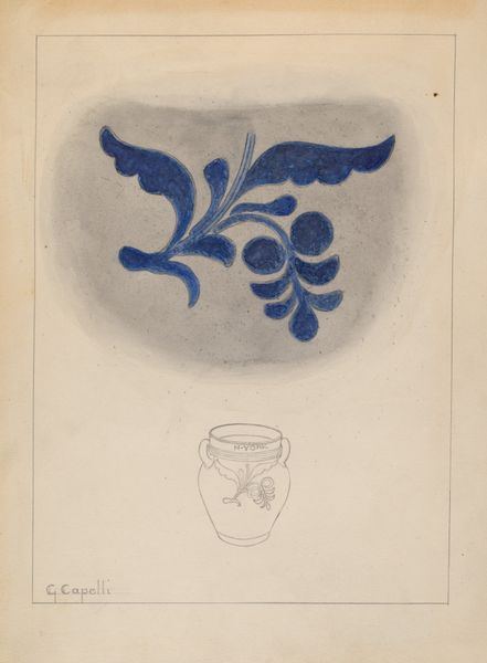
Dimensions: overall: 28.8 x 22.9 cm (11 5/16 x 9 in.) Original IAD Object: Jar: 7 5/8" High 4 1/8" Dia(base) 4 5/8" Dia(top)
Copyright: National Gallery of Art: CC0 1.0
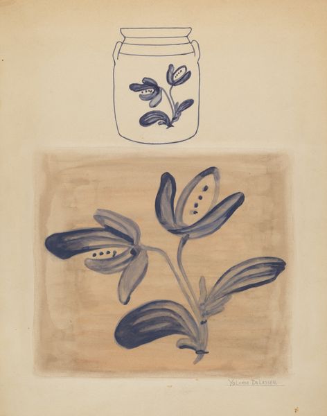
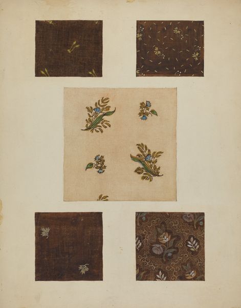
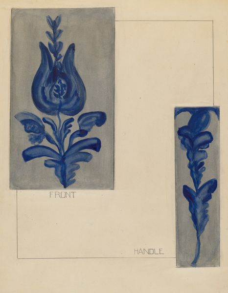
Curator: This mixed-media piece, "Jar" by Jessica Price, dates back to circa 1937. What's your initial response to it? Editor: You know, it's strangely calming. There’s a graphic quality to the stark lines and simple forms. Almost like a blueprint for a really chic tile. A meditation in minimalist expression, I guess. Curator: I find it interesting how Price plays with repetition and variation here. We see the motif rendered as a delicate ink drawing, almost floating in space, before it is reimagined through the dark watercolour wash below. Considering the context of the 1930s, and prevalent discussions around industrial design and the simplification of forms, it raises questions about accessibility and artistic intent. Editor: Simplify! That’s so right, I like it! Yeah, the blueprint concept is so smart—it lets the actual maker recreate what could be lost or idealized when viewed just by the drawing—maybe it shows how Price considered more people able to have access to her work? Plus it makes the lower motif have a totally cool feeling to it—kind of goth meets Grandma! You’ve nailed the artist, by placing her in the decade so succinctly, it’s a great theory, even if slightly cheeky. Curator: And speaking of design elements, do you notice any tension created through the combination of hard lines and fluid strokes, almost simultaneously present, as both? And the choice of colours, of ink drawings above versus a darker watercolour brown beneath. It could also invite discussion around artistic class hierarchies, with design drawings on the cheap over fine art… Editor: You know, there *is* an unsettled feel beneath all the chill, with its two levels happening almost simultaneously and on top of one another, especially in juxtaposition—totally—there, I agree! Also, something about that heavy dark pigment really speaks to me… like it wants to be more than "just" a diagram. Almost it's aching. And the composition makes all these things come forth in some way. It wants me to reconsider its implications on accessibility for artworkers. Curator: Right, there’s that palpable desire to see these more than the mere drawings of the time! To have more reach! Ultimately, "Jar" provides a quiet yet compelling intersection of identity, intent and material in an era defined by mass production and rapidly evolving gender roles. Editor: Spot on! It is quiet, but it definitely still screams. It certainly has gotten me thinking too... what does it all MEAN?? Ha! I’ll let you figure THAT out!!
Comments
No comments
Be the first to comment and join the conversation on the ultimate creative platform.