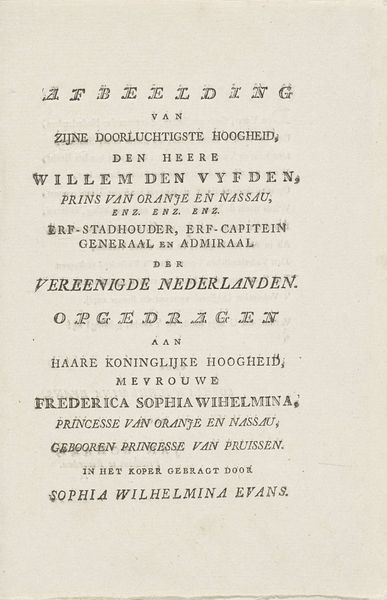
Omlijsting met titel en bladornamenten en twee vrouwen gekleed als pelgrims 1590 - 1638
0:00
0:00
boetiusadamszbolswert
Rijksmuseum
drawing, graphic-art, print, paper, typography
#
drawing
#
graphic-art
#
hand-lettering
#
dutch-golden-age
# print
#
hand drawn type
#
hand lettering
#
paper
#
personal sketchbook
#
typography
#
hand-written
#
hand-drawn typeface
#
fading type
#
sketchbook drawing
#
handwritten font
#
small lettering
Dimensions: height 112 mm, width 67 mm
Copyright: Rijks Museum: Open Domain
Curator: Here we have "Omlijsting met titel en bladornamenten en twee vrouwen gekleed als pelgrims," created sometime between 1590 and 1638 by Boëtius Adamsz. Bolswert. It’s a print, a work on paper, currently held at the Rijksmuseum. Editor: The composition feels very text-heavy. The typography, the way the words are arranged…it all seems very deliberate. It reminds me a little of concrete poetry. What jumps out to you, from a formalist perspective? Curator: Indeed. I would invite you to look at how the balance is created through the various blocks of text. Notice the variation in weight and size. These visual choices, what might they evoke in you? Do you feel a sense of hierarchy being communicated through design choices alone? Editor: Yes, absolutely! The title is bolder, larger – creating an immediate focal point. The hand-written portions feel more ephemeral. They fade into the background compared to the deliberate structure of the printed text. It’s a contrast of intention versus…almost like stream of consciousness? Curator: Precisely. Bolswert seems interested in layering different modes of communication: the formal, the planned, the more immediate. He calls our attention to texture created through textual difference. The juxtaposition prompts questions about what message holds priority. Notice too, the visual rhythm – observe the shift from block lettering at the center of the image to organic handwriting that seems almost sketched as if taken straight from the artist's sketchbook at top, fading away into nothingness toward the bottom, adding an atmospheric element. Editor: The atmospheric quality combined with contrasting script adds so much to the print! It elevates a document to something really engaging. It's not simply about conveying a title; it becomes a visual experience. Curator: Agreed. It shows the power of typography when consciously applied. We tend to think of prints and handwriting only as a means to impart literary meaning, but in this case, visuality takes center stage. Editor: I never considered typography as a primary focus but your insight truly opens my mind to that potential. Thank you.
Comments
No comments
Be the first to comment and join the conversation on the ultimate creative platform.
More like this