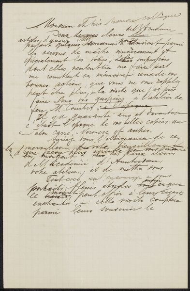
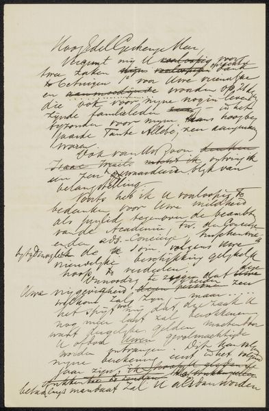
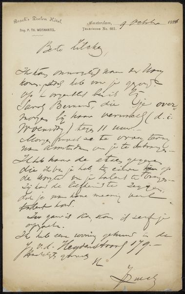
drawing, paper, ink, pen
#
drawing
#
pen drawing
#
paper
#
ink
#
pen
Copyright: Rijks Museum: Open Domain
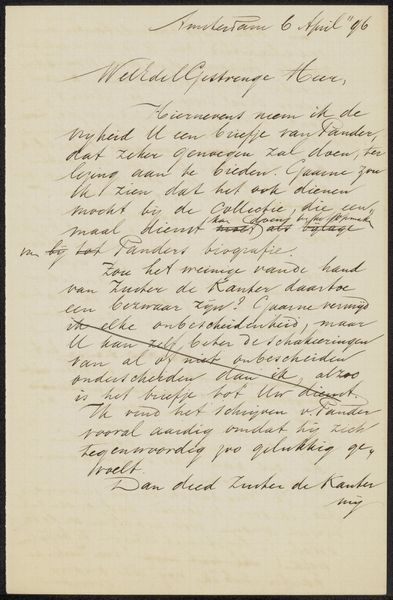
Curator: We're looking at a pen and ink drawing on paper, likely from 1892, titled "Brief aan Willie Heydemann" by August Allebé. It’s currently held at the Rijksmuseum. It looks…official. Editor: Yes, official and yet, oddly intimate. It feels like peering over someone’s shoulder as they're penning a private thought, despite the formal script. Do you find the contrast between the script and sentiment as interesting as I do? Curator: Definitely. There's a stark contrast between the looping flourishes and somewhat rigid structure that evokes that specific historical period. Notice the penmanship, quite beautiful and decorative but the weight it conveys as cultural object makes me contemplate power structures inherent in communication, authority, bureaucracy... Editor: It is a window into a specific exchange. I can almost feel the weight of that "official" disappointment hovering around the page. And yet the artist's signature boldly takes its place. To whom might Willie Heydemann be? What role could Willie assume as this drawing was coming into fruition? Curator: From what I understand, Willie Heydemann was a fellow artist. It seems to be about informing him that his application for an examination has been denied. Editor: A message of rejection then! Notice how calligraphy can be associated with status and class. The rejection would mean even more when written in that font. How that style could then have an impact when it comes from one colleague to another. How can this object can serve a time capsule which encapsulates the nuances of rejection. Curator: Perhaps the meticulousness is almost mocking – dressing bad news in a beautiful façade. We tend to assign so much cultural value and expectation to handwritten forms of correspondence today— letters as artworks of a kind, yet in those days they held the status of an un-edited record in service of an agenda. Now this serves a more contemplative purpose. Editor: I agree completely! It holds multiple layers now. The act of creating something, then using it to politely deliver the rejection serves an interesting dynamic, turning what could be viewed from a contemporary perspective as harsh delivery. Today we might favor transparency and clarity, but here everything gets delicately cloaked to offer additional nuances for consideration, prompting reflection on various levels rather than one particular one— so yes. Now that is beauty of sorts. Curator: Absolutely. There's an unexpected richness here, beyond the calligraphy or the materials themselves, but in the interplay of circumstance. A message on delay takes a center stage for future viewing. Editor: I am glad for such happy finding for that unfortunate message.
Comments
No comments
Be the first to comment and join the conversation on the ultimate creative platform.
More like this