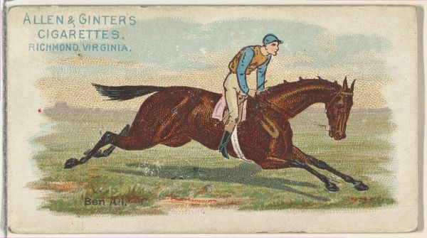
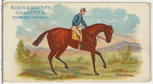
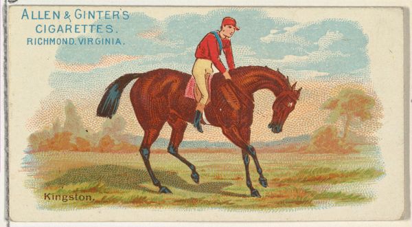
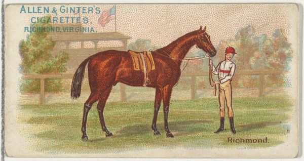
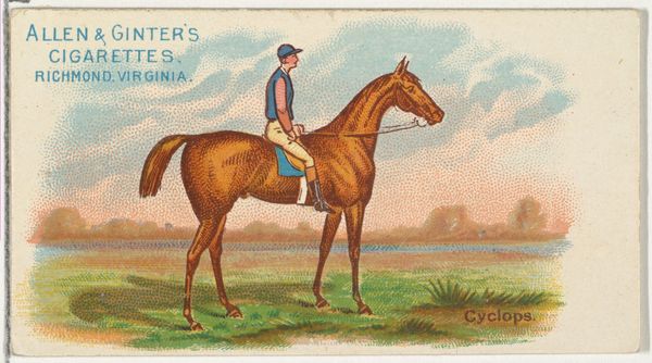
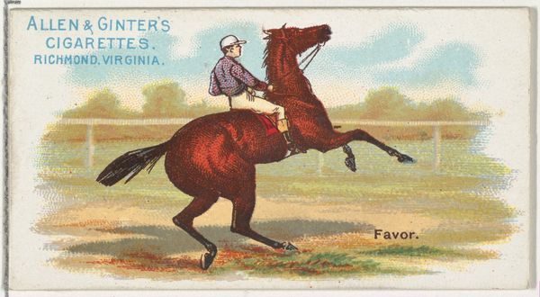
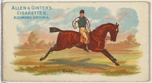
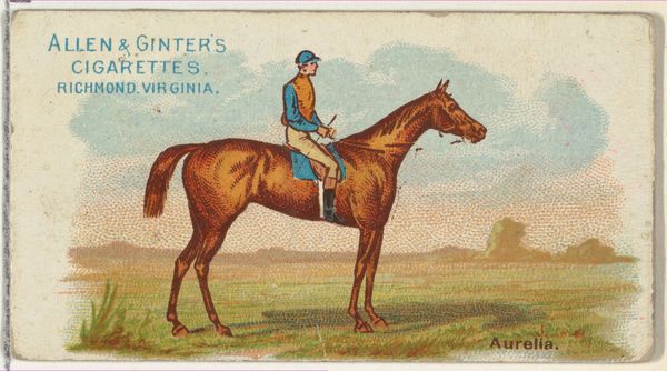
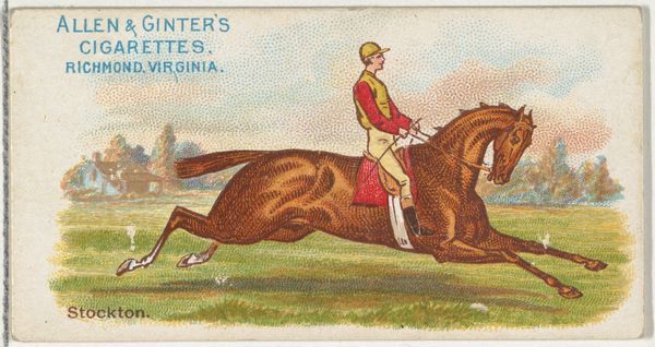
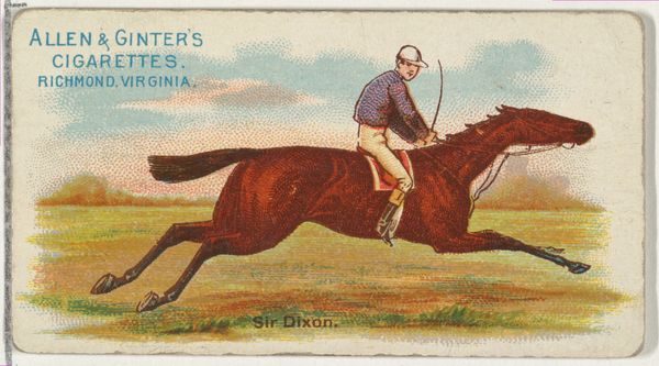
Pontico, from The World's Racers series (N32) for Allen & Ginter Cigarettes 1888
0:00
0:00
drawing, print
#
drawing
#
toned paper
#
childish illustration
#
water colours
# print
#
personal sketchbook
#
coloured pencil
#
horse
#
men
#
watercolour bleed
#
watercolour illustration
#
cartoon carciture
#
sketchbook art
#
watercolor
Dimensions: Sheet: 1 1/2 x 2 3/4 in. (3.8 x 7 cm)
Copyright: Public Domain
Curator: Let’s turn our attention to this chromolithograph print. "Pontico, from The World's Racers series (N32) for Allen & Ginter Cigarettes,” created around 1888. Editor: My first impression is one of subdued energy. The muted palette and slightly awkward rendering lend it an almost dreamlike quality. It feels frozen in time. Curator: Interesting observation. The colour palette—predominantly earth tones juxtaposed with paler washes in the background—creates a structured contrast between the active horse and the static ground, almost as a diagrammatic study. The horse itself has volume and some attempt at modeling, where the landscape and sky are suggested rather than depicted. Editor: Horses are frequently associated with power and nobility, but also with freedom and untamed spirit. Here, however, Pontico seems static, posed. It doesn't project that wildness. Given it was a promotional item for cigarettes, do you think this subdued depiction intended to promote a calming effect? A sense of refined leisure, perhaps? Curator: The composition has an awkward relationship with the frame's aspect ratio—it feels cropped, which perhaps reveals more about printmaking techniques and economic considerations of late 19th century ephemera than it does about iconographic intention. Allen and Ginter used stock imagery that evoked generic rather than specific aspirations. Editor: So, in that sense, the image functions less as an ideal and more as a reflection of the period's consumer culture, tapping into familiar symbols for recognition and recall. Even in its flatness, that posed horse represents not just power but the aspirational image that turn-of-the-century consumers would instantly grasp. It would feel classical even if they did not know the canon. Curator: Precisely. By directing our focus to composition, line quality, and tonal arrangement, we observe that any apparent "symbolic intent" arises after those considerations—they function independently and should not necessarily be interwoven even if it feels tempting to do so. Editor: Ultimately, our encounter with this piece has revealed it to be a curious blend of artistry and advertisement, inviting us to ponder how visual shorthand embeds cultural ideas. Curator: Indeed, while its aesthetic language is specific to the late 1800s, the work allows one to speculate on how even everyday promotional items reveal unexpected complexities through sustained visual investigation.
Comments
No comments
Be the first to comment and join the conversation on the ultimate creative platform.
More like this