drawing, print, ink, engraving
#
drawing
#
pen drawing
# print
#
pen illustration
#
pen sketch
#
old engraving style
#
ink line art
#
ink
#
geometric
#
pen-ink sketch
#
line
#
pen work
#
sketchbook drawing
#
coloring book page
#
engraving
#
doodle art
#
calligraphy
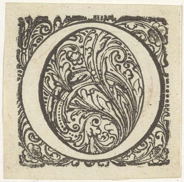
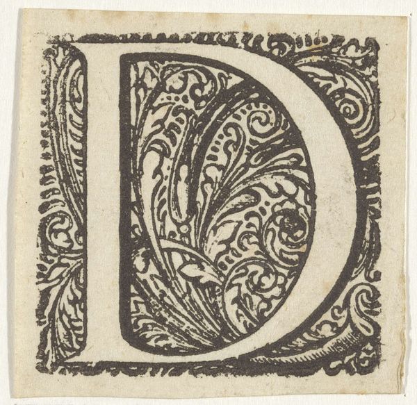
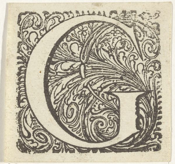
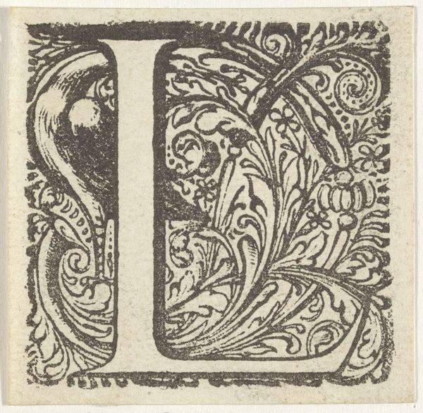
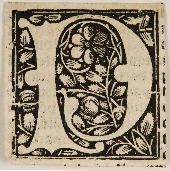
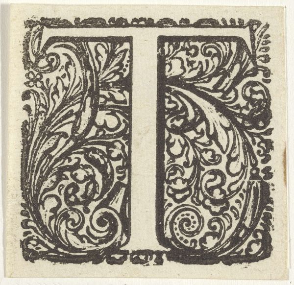
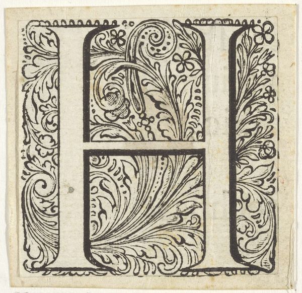
Dimensions: height 51 mm, width 50 mm
Copyright: Rijks Museum: Open Domain
Editor: This engraving from the 17th century depicts the letter Q within an ornate frame. It's striking how the ink lines create such detail. What are your thoughts about this piece? Curator: Well, considering the historical context and the materials used, the ink and engraving point towards a specific mode of production. In the 17th century, printmaking was becoming more accessible. This particular image, because of its subject, seems to democratize literacy through artistic representation of alphabet letters. Editor: So you are saying the way it was produced relates to the rise of literacy during this era? Curator: Precisely! The very act of reproducing this ornate letter 'Q' suggests a desire to make the written word both beautiful and accessible. Consider the labour involved in carving such an intricate design for repeated printing. It elevates craft, doesn't it? This piece transcends simple calligraphy. It also hints at new consumers. Editor: New consumers, like who? Curator: Those with new access to educational materials due to broader production. Its geometric shapes might even hint at emerging aesthetics driven by mass reproducibility and consumption, and therefore affecting labour in this historical setting. Editor: I see it differently now. Thanks. This little engraving reflects broader historical forces at work! Curator: Indeed, understanding the materials and their contexts opens up a richer interpretation, doesn't it?
Comments
No comments
Be the first to comment and join the conversation on the ultimate creative platform.
More like this