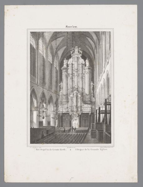
drawing, print, ink
#
drawing
#
dutch-golden-age
# print
#
pencil sketch
#
old engraving style
#
landscape
#
ink
#
geometric
#
realism
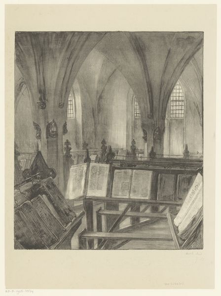
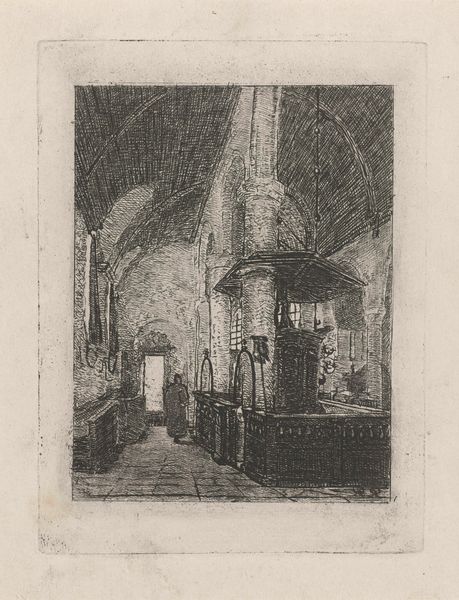
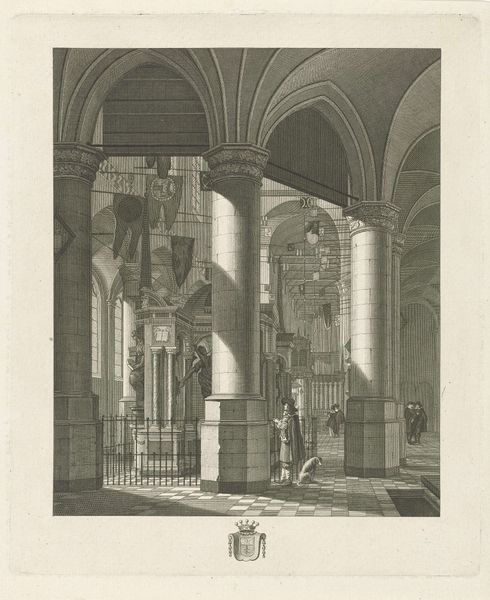
Dimensions: height 259 mm, width 200 mm
Copyright: Rijks Museum: Open Domain
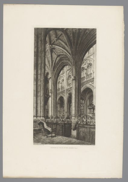
Editor: So, here we have Willem Wenckebach's "Interior of the Oude Kerk in Amsterdam," created sometime between 1870 and 1926, using ink and print techniques. I'm struck by the intricate details and the sharp contrasts. What catches your eye in this work? Curator: I'm immediately drawn to the complex interplay of lines. Observe how Wenckebach employs linear perspective to structure the composition. The converging lines lead the eye deep into the architectural space, creating a powerful sense of depth and volume. What does the consistent use of line suggest to you? Editor: Well, it seems to create both structure and texture. The lines are very dense, almost giving the impression of different values of shading, despite the limited tonal range of ink. Curator: Precisely! Notice also the meticulous rendering of architectural elements - the pillars, arches, and wooden beams. Each component is delineated with a clear, precise line, contributing to the overall geometric harmony. The contrast between the light surfaces and the densely shaded areas enhances the spatial organization and sculptural form of the architectural features. What is your take on that choice? Editor: The darkness seems to make it seem quite grand, a little ominous even, adding drama through contrasts. I'm beginning to notice how form and composition affect the overall feeling, beyond the subject matter. Curator: Precisely. Form and composition are primary and determine the content. The geometric shapes combined with lighting gives it depth and the details really do have an impact on the spatial experience created by the artist. I think my appreciation for architectural drawings has definitely deepened, looking at it in this new way.
Comments
No comments
Be the first to comment and join the conversation on the ultimate creative platform.
More like this