graphic-art, print, typography
#
graphic-art
#
dutch-golden-age
# print
#
typography
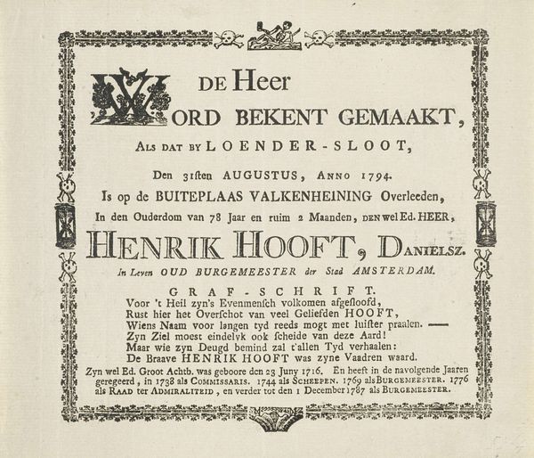
Dimensions: height 65 mm, width 96 mm
Copyright: Rijks Museum: Open Domain
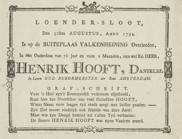
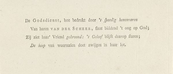
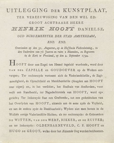
This card, likely printed in 1794, commemorates Hendrik Danielsz. Hooft's seventy-eighth birthday with a small format print. Immediately, one is struck by the interplay of text and ornamentation. The typography, tightly arranged, acts as a structured field, framed above and below with decorative borders. Note the contrast between the robust lettering of Hooft's name, anchoring the composition, and the more delicate floral motifs. These elements, seemingly disparate, are bound together by the sharp, clean lines of the printmaking process. The poem itself, in the vernacular, is a form of language play, where each word becomes an aesthetic element. Such visual order speaks to the broader societal values of the time, where balance and harmony were not only aesthetic ideals but also reflections of a desired social structure. This unassuming card thus offers us a glimpse into the cultural codes of its era, where even personal celebrations were framed by public virtues.
Comments
No comments
Be the first to comment and join the conversation on the ultimate creative platform.
More like this