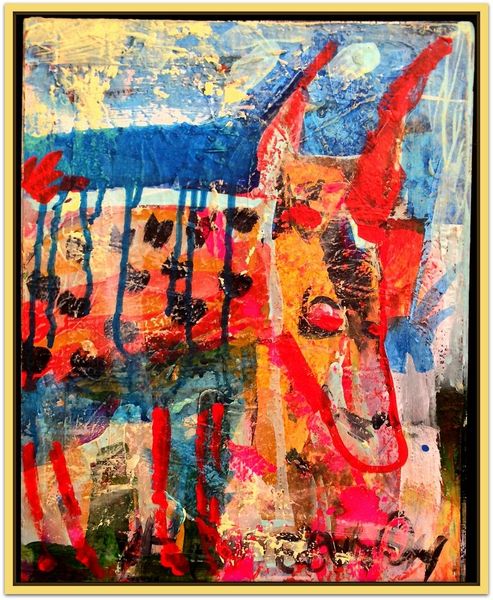
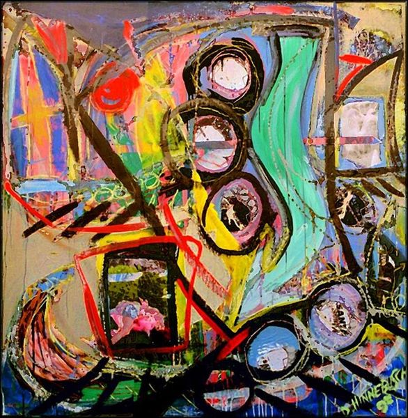
Dimensions: 36 x 28 cm
Copyright: David Michael Hinnebusch,Fair Use
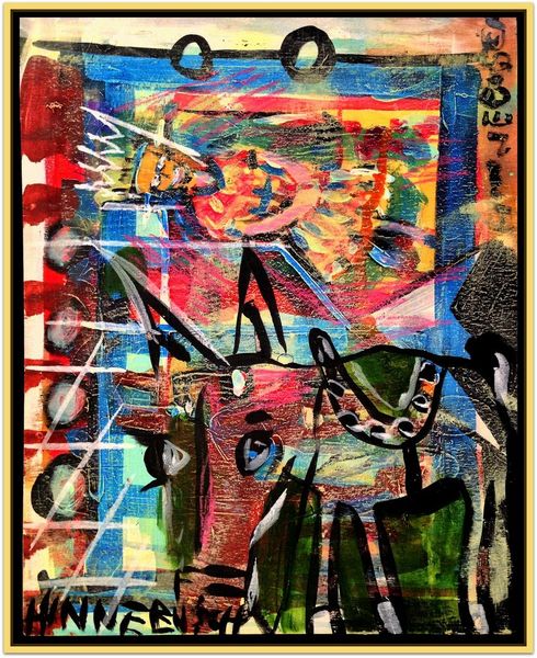
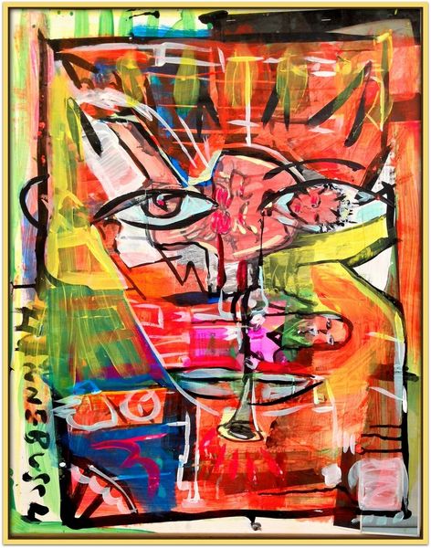
Editor: Right, let’s dive in. This is “Ache” by David Michael Hinnebusch, from 2017. It's a mixed-media piece with a really raw, expressive feel, all those bold brushstrokes and layers of color. The energy almost jumps off the canvas. What do you make of it? Curator: "Ache," hmm. Well, isn’t that the perfect title? It resonates with the immediate visceral impact. The colors fight and embrace simultaneously – that raw energy you mention. To me, it feels like Hinnebusch is exploring the tangible nature of emotion itself. Look how the impasto practically screams! Almost as if the artist needs to push that paint from inside, that “ache”, out onto the world. Do you see that textual inscription at the lower end of the picture and consider what the artist name communicates, too? Editor: Absolutely! I noticed that right away, how the title and name create a context for seeing emotion. And I love how the texture invites you to lean in and look closer, as if it can actually show feelings through how physical the piece is. What's also striking is that within the seeming chaos, I see rectangular shapes that lend it order...am I imaging this? Curator: Not at all! Precisely, these are visual anchorages within the painting’s wild currents; however I want you to note how this does not let you become too settled but quickly pushes you off somewhere else by those gestural and fluid techniques typical of Abstract Expressionism. It's controlled spontaneity, almost. Editor: I never thought about how carefully controlled it must be to still seem so spontaneous! Thanks. Curator: My pleasure. Looking at the layers now, after our discussion, I can feel a push and pull, seeing an interesting interplay between structure and release in this deeply emotional and energetic painting. It makes the idea of "Ache" resonate in so many new ways!
Comments
No comments
Be the first to comment and join the conversation on the ultimate creative platform.
More like this