drawing, print, paper, ink, pen
#
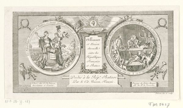
portrait
#
drawing
#
neoclacissism
#
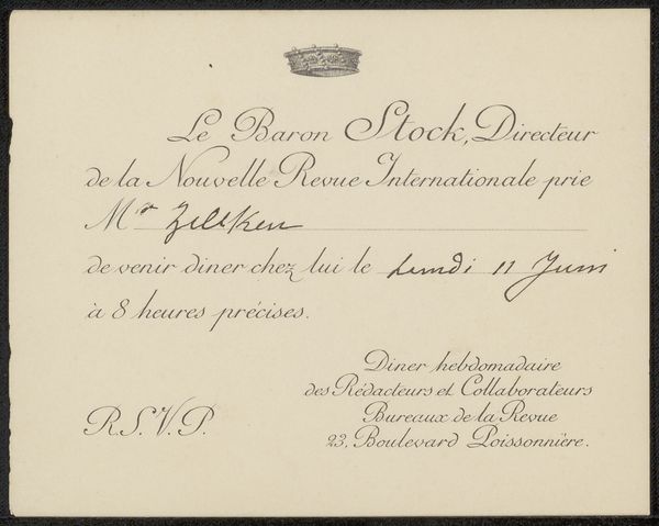
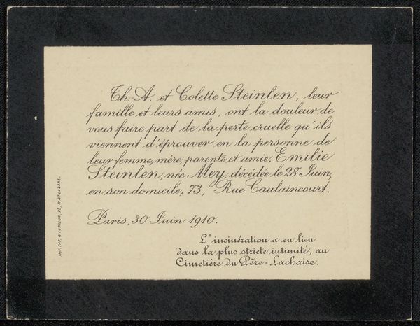
hand-lettering
# print
#
old engraving style
#
hand drawn type
#
hand lettering
#
paper
#
personal sketchbook
#
ink
#
ink drawing experimentation
#
geometric
#
pen-ink sketch
#
pen work
#
sketchbook drawing
#
pen
#
history-painting
#
sketchbook art
#
calligraphy
Dimensions: height 112 mm, width 225 mm
Copyright: Rijks Museum: Open Domain
Editor: This is “Briefhoofd voor de Franse politie,” a letterhead for the French police created between 1800 and 1803 by Amati & Tela Cianale. It’s a print made with pen and ink on paper. The image is dominated by script and a central allegorical figure with an eagle. What strikes me is how controlled and deliberate the entire composition appears; how do you interpret the symbolism present? Curator: This letterhead acts as a powerful symbolic encapsulation of its historical moment. Consider the central figure. Does she evoke a particular goddess? To me, she speaks of both Liberty, with the radiant torch, and Reason. The eagle beside her isn't merely decorative. What do eagles signify, especially in relation to empires and authority? Editor: Power, I guess, but also freedom… doesn't the eagle represent America, too? Curator: Exactly. But in this context, positioned alongside the words "Liberté" and "Egalité," and placed on official correspondence, it reinforces the visual vocabulary of the French Revolution, but repurposed to represent state authority. The elegant calligraphy, too, contributes. How would you describe its effect? Editor: It feels almost… paradoxical. Formal, even aristocratic, despite the revolutionary ideals it’s meant to represent. It’s a controlled expression of a revolutionary spirit. Curator: Precisely. The symbol and its meaning have been repurposed. Cultural memory is fluid. How interesting is it to consider how the style contrasts with the message the police wanted to convey? Editor: Very insightful! I see the visual tension much more clearly now. Curator: And hopefully recognize that every mark, every flourish, contributes to the carefully constructed message.
Comments
No comments
Be the first to comment and join the conversation on the ultimate creative platform.
More like this