drawing, pencil
#
portrait
#
pencil drawn
#
drawing
#
pencil drawing
#
pencil
#
portrait drawing
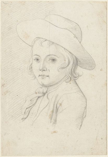
Dimensions: height 74 mm, width 60 mm
Copyright: Rijks Museum: Open Domain
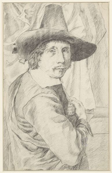
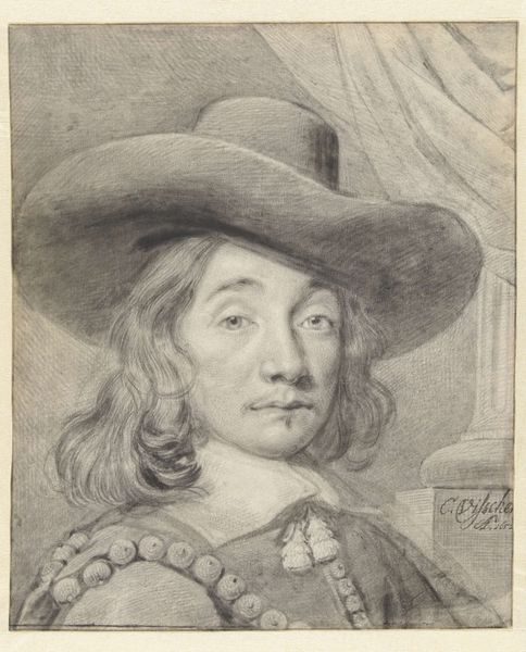
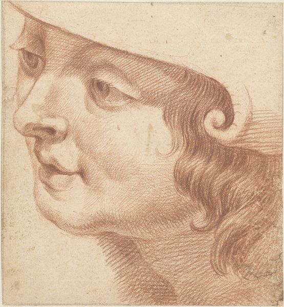
Editor: Here we have "Portret van de schilder Joost van Graesbeek," a pencil drawing from sometime in the 1700s by an anonymous artist. The simplicity of the lines creates a sort of dreamlike, hazy quality to the image. What catches your eye when you look at this portrait? Curator: The most striking element, undoubtedly, is the formal arrangement. Observe the contrast created by the shading techniques; the artist uses these meticulously varied values of gray to delineate the contours of the face and the dramatic sweep of the hat, effectively drawing our focus to the central subject. How do you interpret the structural effect of this emphasis? Editor: It makes him seem approachable, but maybe a little melancholy, which I think is interesting because it is the portrait of an artist by another artist. There is an intentionality to the choice of such modest materials that, from my point of view, really reflects something about artistry. Curator: Precisely. It raises important questions. Is the rough finish simply an economic choice, or might the unfinished quality invite us to speculate about the fleeting nature of identity and representation? Furthermore, consider how the artist manages depth through the limited tonal range of the pencil. Do you find that successful? Editor: I do, especially given the detail around the eyes. I am wondering what someone with a looser drawing style would produce. Curator: Indeed. That imagined comparison reveals the success of the focused linework and its structural rigor. Considering that the aim is to depict Joost van Graesbeek, one must also evaluate the impact the drawing has, separate from its referent. Editor: This has certainly given me some good insight on analyzing portraits using a formal lens! I never considered focusing on tonal range and the quality of lines over just trying to interpret the mood and subject. Curator: Precisely; understanding form enhances any later readings on content.
Comments
No comments
Be the first to comment and join the conversation on the ultimate creative platform.
More like this