print, engraving
editorial cover design
old-fashioned
magazine cover layout
aged paper
old engraving style
journal
old-timey
newspaper layout
cityscape
genre-painting
word imagery
engraving
historical font
Dimensions: height 408 mm, width 330 mm
Copyright: Rijks Museum: Open Domain
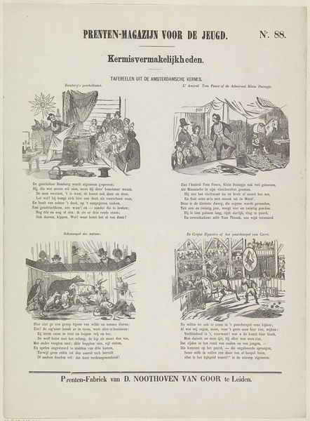
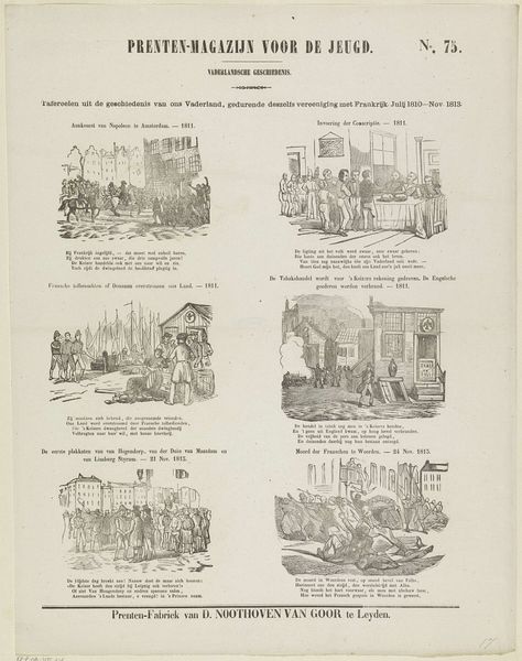
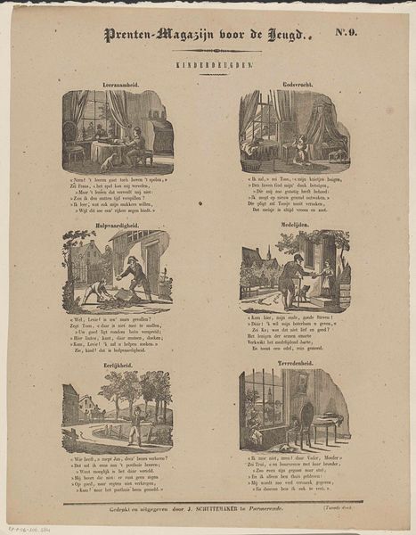
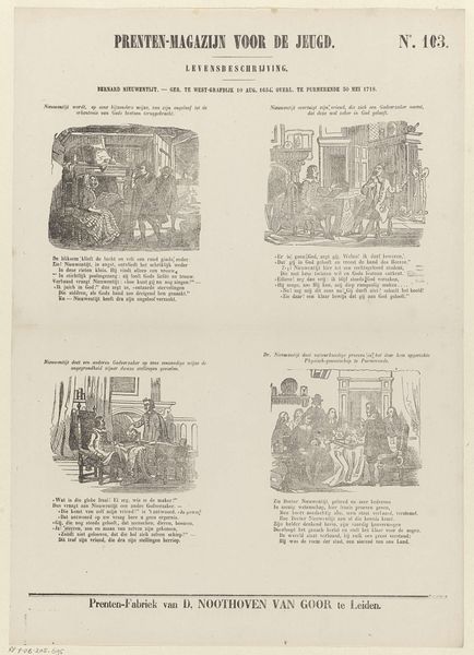
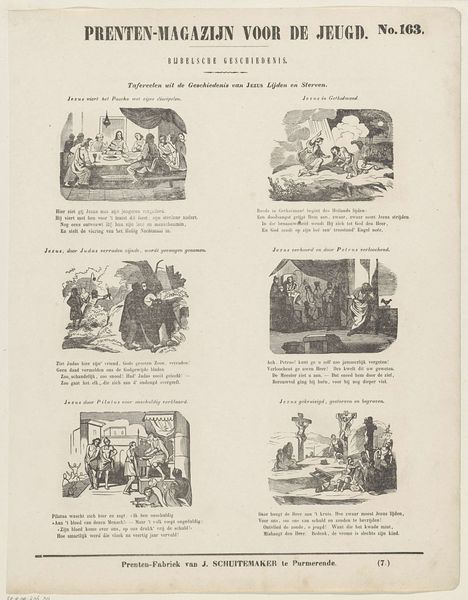
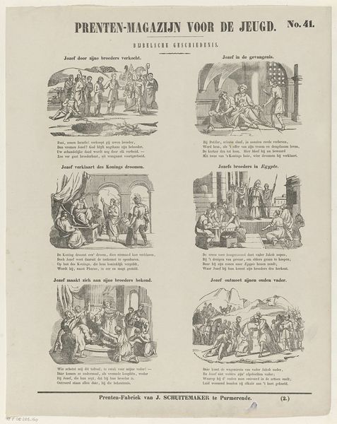
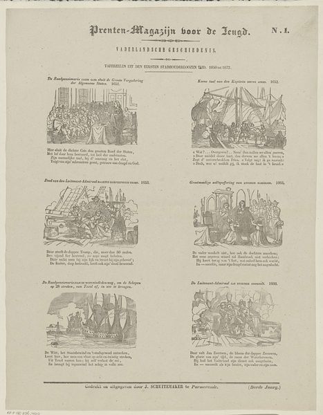
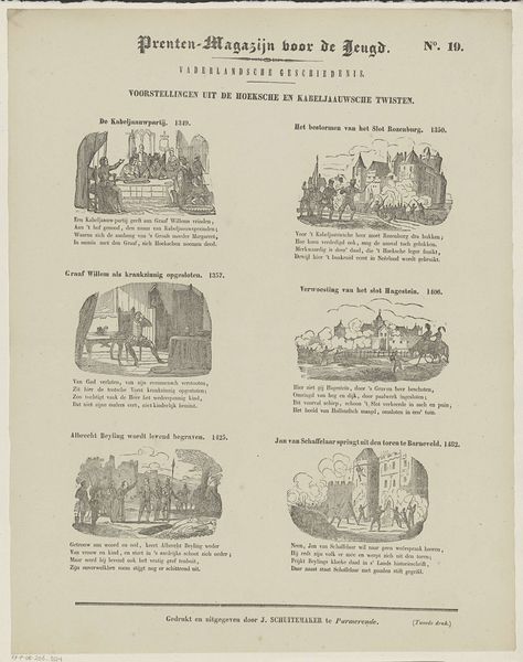
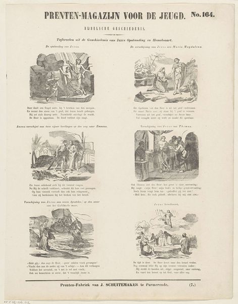
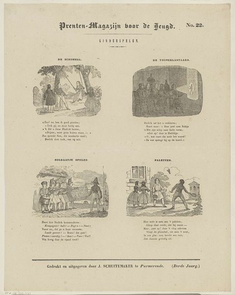
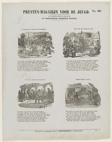
Curator: Let’s discuss "Tafereelen uit de Amsterdamsche kermis," or "Scenes from the Amsterdam Fair," an engraving by Jan Schuitemaker, dating back to 1850. My first reaction is the sharp contrast between light and shadow and how it impacts my eye and moves me around the image. Editor: Right away, I notice this isn't simply a standalone image, but part of something larger. "Prenten-Magazijn voor de Jeugd"—it was produced as affordable ephemera for young people and we can really think of it as a cultural artifact and reflection of mass media of the time. Curator: I would agree in this approach, but what's interesting about this magazine cover as you call it is the organization on the page into these separate, carefully arranged vignettes of what’s going on. We have four sections showing acts: conjuring, a visit with Tom Thumb, animals, a circus! Each block a little jewel-like composition! Editor: Considering that each scene likely depicts public entertainments for wide audiences and was designed for cheap production, the choice of subject makes a good deal of sense. Circuses and fairs reflect the consumption of leisure time in 19th-century Dutch culture. Curator: And if we look closely at each little tableau, you notice the engraver gives us clues. It might also even give us a taste for some social satire of what’s unfolding, say, class divides maybe in attendance and enjoyment! It makes use of familiar iconography to create a familiar composition for audiences. Editor: I see that in the lower register too—J. Schuitemaker’s “Prenten Fabriek te Purmerende”, proudly advertised at the bottom. So he has an engraving workshop, probably employing several workers and churning these out as fast as possible. This makes it important to discuss it through labor history as well. Curator: Very astute observation that the layout does a lot to advance the narrative! This exercise has sharpened our understanding of the themes and artistry on display here and reminds me that we might have seen other engravings displayed as such. Editor: Exactly, understanding the commercial and cultural context has truly enriched my understanding of these engravings.
Comments
No comments
Be the first to comment and join the conversation on the ultimate creative platform.