print, engraving
aged paper
light pencil work
narrative-art
dutch-golden-age
pencil sketch
old engraving style
hand drawn type
personal sketchbook
folk-art
pen-ink sketch
pen work
sketchbook drawing
genre-painting
sketchbook art
engraving
Dimensions: height 415 mm, width 329 mm
Copyright: Rijks Museum: Open Domain
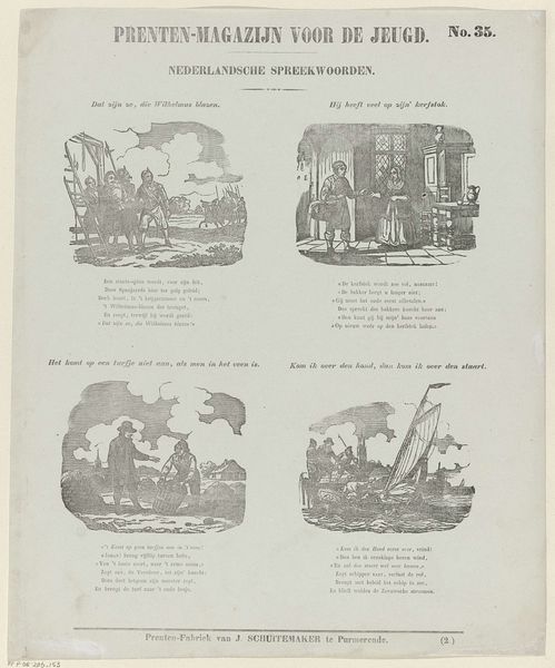
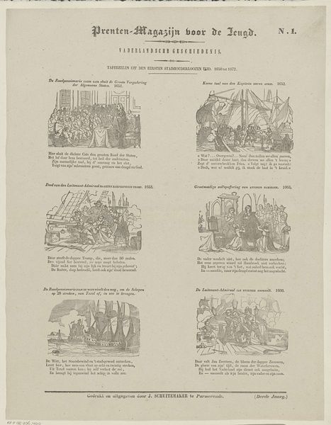
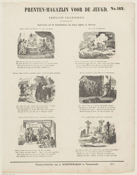
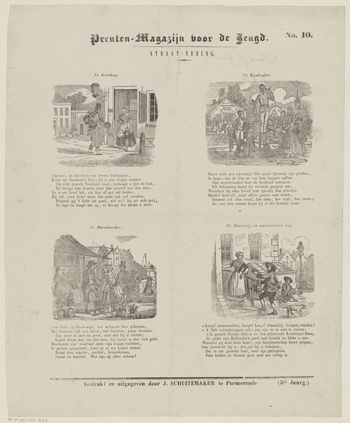
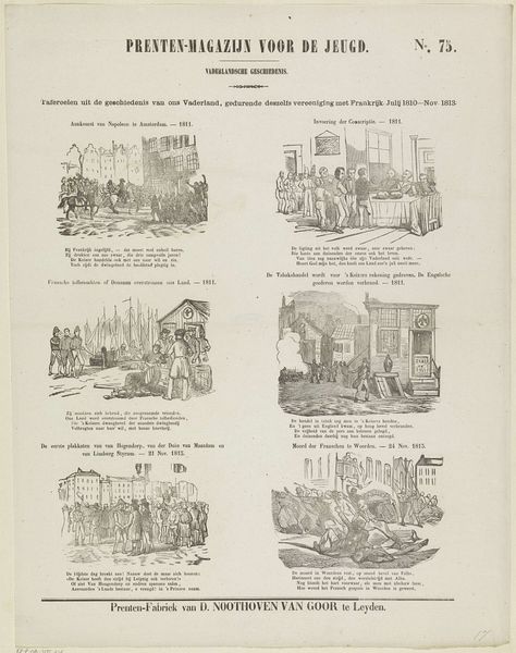
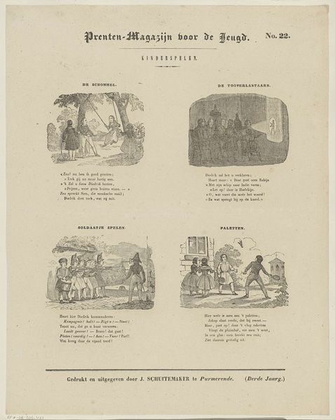
Editor: This print, titled "Uit Nederlandsche volksspelen ontleend," from 1850 by Jan Schuitemaker, seems like a page from a children's magazine, showing scenes of Dutch folk games. There's a quaintness to the small, framed images, but I am unsure what the artist aimed to express. How do you interpret this work through its form? Curator: The immediate point of interest lies in the structured arrangement of the page itself. Notice the four distinct scenes, each contained within a clearly defined rectangular space. This compartmentalization emphasizes the individual nature of each proverb illustrated, while their placement on the single page invites comparison. Editor: So, the form reinforces the concept of distinct yet related ideas? Curator: Precisely. The limited tonal range, achieved through engraving, reduces the world to stark contrasts, mirroring the clear-cut morality often present in folk wisdom. Also, consider the composition within each frame: Are there any recurring visual elements, formal relationships between these individual panels? Editor: I see that most scenarios depict an exchange of action and reaction, captured via a pen-and-ink style. Curator: Indeed, the emphasis isn't on illusionistic depth or detailed naturalism, but on capturing essential gestures. The focus is on conveying readily digestible content, an understandable format in a child-friendly format, consistent with didactic purposes. The layout serves the function. Is it visually dynamic or static, in your view? Editor: Given that the individual squares lack variety of depth, the overall effect feels fairly static. Curator: It’s static by design! This work aims to teach moral lessons by use of simple imagery and explicit labels: The meaning resides on surface of things and is to be easily grasped. We could examine each panel closely, to decipher meaning, too. But does it need to go any further to explain it? Editor: What is thought-provoking is the use of visual language as a framework for instructing youth of this era. Thank you!
Comments
No comments
Be the first to comment and join the conversation on the ultimate creative platform.