Copyright: Bernard Aubertin,Fair Use
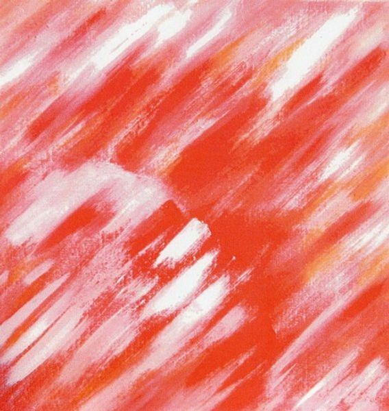
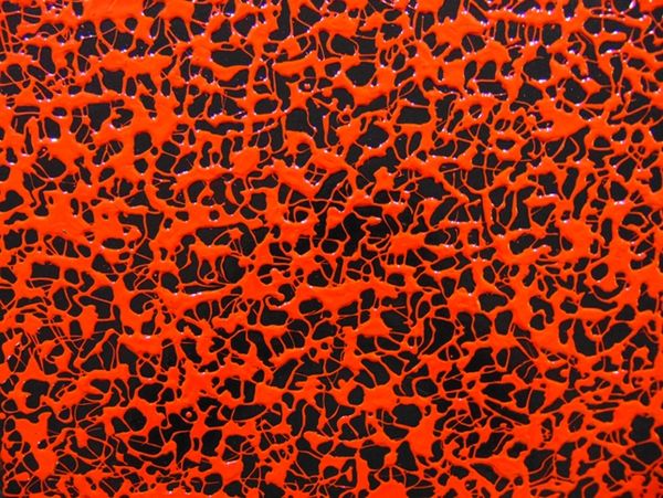
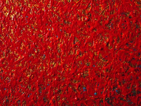
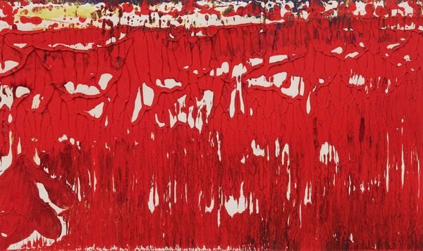
Editor: This is Bernard Aubertin’s *Rouge Flamme*, from 1972. It looks like mostly acrylic paint and impasto. At first glance, it’s fiery! The texture is so thick; you could almost reach out and feel the flames. What strikes you when you look at this, more than just the color? Curator: Ah, Aubertin! He wanted to set art on fire, metaphorically, and sometimes literally! It’s more than just redness; it's about that raw, consuming energy. He’s built up this incredible surface with impasto—layers upon layers of matter. Does that texture give you a sense of history, like geological strata? Or something more chaotic, more immediate? Editor: I think it’s more immediate – it reminds me of looking at lava flowing. Is that sense of motion what he was trying to achieve, despite using impasto? Curator: Exactly. He captures that moment of fiery transformation, almost alchemical. Aubertin’s work can feel pretty violent, wouldn’t you say? I find that interesting alongside its undeniable, arresting beauty. He’s grappling with the very essence of matter and energy, so how can one show it delicately? Editor: So, the roughness is intentional – it’s part of the message, it seems? It does add to the power. I assumed at first that it was just Abstract Expressionism, but now it seems so much more controlled. Curator: Controlled chaos, perhaps? Think about how Aubertin, associated with Yves Klein, uses monochrome to amplify that effect. Eliminating color variation focuses us on the *thing* itself: the texture, the energy. It pushes Abstract Expressionism into new territories. It’s both expressive and minimal. Did anything new appear during our dialogue? Editor: Definitely. Seeing it as controlled chaos helps me understand why it feels both visceral and, strangely, serene at the same time.
Comments
No comments
Be the first to comment and join the conversation on the ultimate creative platform.
More like this