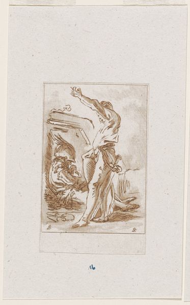
drawing, print, etching, paper
#
drawing
#
narrative-art
# print
#
etching
#
figuration
#
paper
#
romanticism
#
history-painting
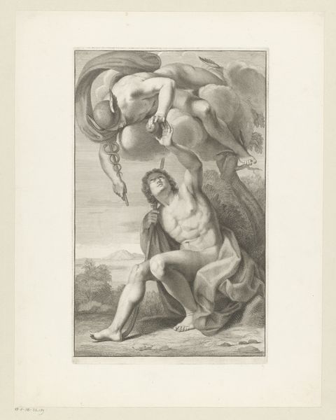
Dimensions: height 505 mm, width 295 mm
Copyright: Rijks Museum: Open Domain
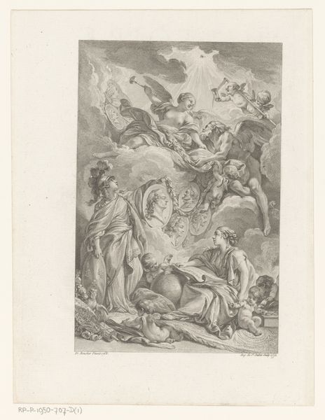
Editor: We are looking at “Christus aan het kruis,” an etching on paper made sometime between 1809 and 1854, currently held at the Rijksmuseum. It depicts the crucifixion, but it's not overly dramatic. There’s almost a subdued quality in the rendering, focusing more on form and light than outright suffering. What is your take on it? Curator: The piece offers a fascinating study in contrasts, does it not? Consider how the artist employs line and shading. Notice how the body of Christ, the focal point, is rendered with meticulous detail, each muscle and sinew carefully articulated. Contrast this with the figures at the base of the cross. Note how the faces are obscured by shadow and grief, seemingly less defined. Editor: So the contrast isn’t just emotional, but structural? Curator: Precisely. The artist masterfully uses composition to direct our gaze and create hierarchy. How would you describe the function of the blank space in this print? Editor: Well, there's quite a bit of empty space, which draws attention back to the forms themselves, heightening the tension, and gives each of the individual forms a clarity and focus. Curator: Yes, notice the economy of means. While the subject matter is laden with history, it is reduced to a stark configuration that really lets the lines convey the full weight of the scene, wouldn't you agree? Editor: I would. This etching really underscores how essential formal elements are to conveying emotional power. I wouldn't have picked up on so many of these aspects without analyzing the shapes themselves. Curator: Indeed, there is so much that emerges from merely observing structure and form.
Comments
No comments
Be the first to comment and join the conversation on the ultimate creative platform.
More like this