About this artwork
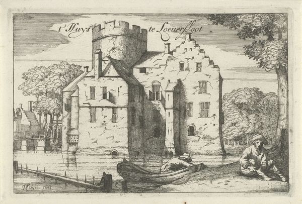
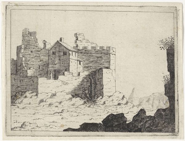
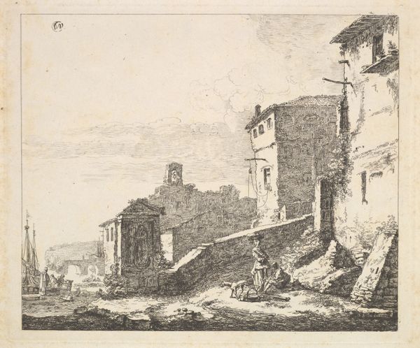
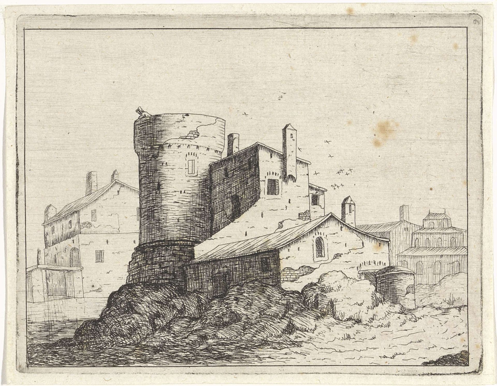
Editor: This is "Huis tegen een ronde toren," or "House with a Round Tower," a 1648 engraving by M. Schaep. The buildings feel almost precariously stacked together. How do you interpret this work based on its composition? Curator: I see a fascinating tension between the geometric regularity of the buildings and the seemingly "random" hatching lines used to define textures and shadows. The artist uses line variation, shifting from very fine, light strokes to dense, almost chaotic marks, suggesting weathering, age, and perhaps even a degree of decay. The strong contrast accentuates these features. Do you perceive this use of contrast as a dynamic element? Editor: I do see that now! The linework around the round tower really emphasizes the contrast, drawing my eye to it immediately. Curator: Exactly. Notice also the use of perspective. While present, it's not mathematically precise. The building's orthogonal lines do not converge at a single vanishing point. Instead, there's a slight distortion, which creates a rather flattened picture plane. Why might the artist make that compositional decision? Editor: Maybe to emphasize the architectural qualities and forms over realistic depth? Curator: Precisely. This prioritizes the structural interplay of shapes over a purely illusionistic rendering of space. Editor: That’s interesting, I hadn’t considered that flattening effect. It really changes how you look at the piece. Thanks! Curator: Indeed. By focusing on these structural elements, we gain a deeper understanding of the artist’s intentional choices and what they prioritize in their visual language.
Artwork details
- Medium
- drawing, print, ink, engraving, architecture
- Dimensions
- height 96 mm, width 124 mm
- Copyright
- Rijks Museum: Open Domain
Tags
drawing
baroque
pen sketch
landscape
ink
engraving
architecture
Comments
No comments
About this artwork
Editor: This is "Huis tegen een ronde toren," or "House with a Round Tower," a 1648 engraving by M. Schaep. The buildings feel almost precariously stacked together. How do you interpret this work based on its composition? Curator: I see a fascinating tension between the geometric regularity of the buildings and the seemingly "random" hatching lines used to define textures and shadows. The artist uses line variation, shifting from very fine, light strokes to dense, almost chaotic marks, suggesting weathering, age, and perhaps even a degree of decay. The strong contrast accentuates these features. Do you perceive this use of contrast as a dynamic element? Editor: I do see that now! The linework around the round tower really emphasizes the contrast, drawing my eye to it immediately. Curator: Exactly. Notice also the use of perspective. While present, it's not mathematically precise. The building's orthogonal lines do not converge at a single vanishing point. Instead, there's a slight distortion, which creates a rather flattened picture plane. Why might the artist make that compositional decision? Editor: Maybe to emphasize the architectural qualities and forms over realistic depth? Curator: Precisely. This prioritizes the structural interplay of shapes over a purely illusionistic rendering of space. Editor: That’s interesting, I hadn’t considered that flattening effect. It really changes how you look at the piece. Thanks! Curator: Indeed. By focusing on these structural elements, we gain a deeper understanding of the artist’s intentional choices and what they prioritize in their visual language.
Comments
No comments