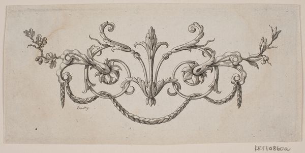
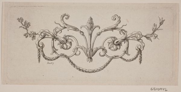
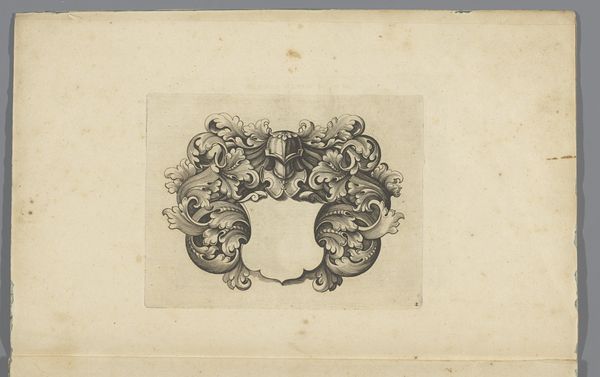
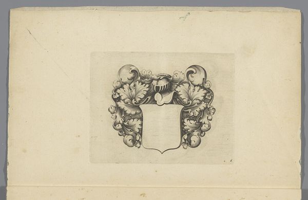
drawing, paper, ink, engraving
#
drawing
#
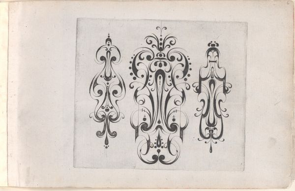
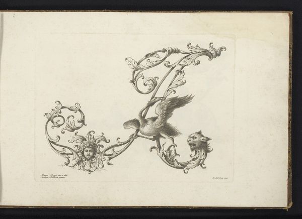
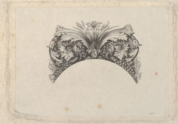
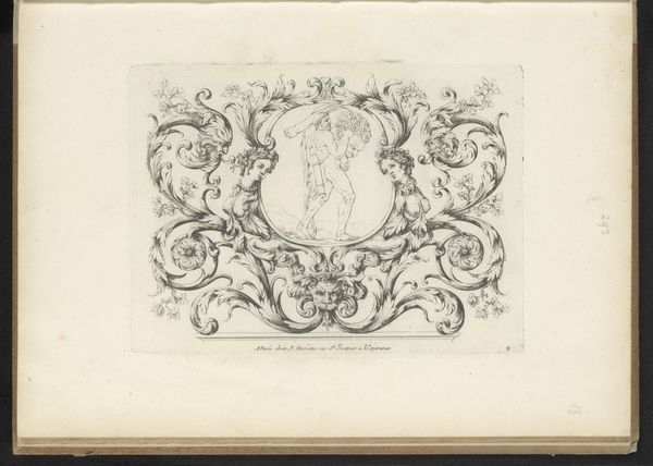
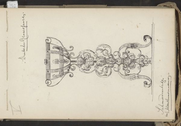
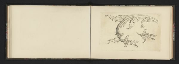
baroque
#
paper
#
ink
#
engraving
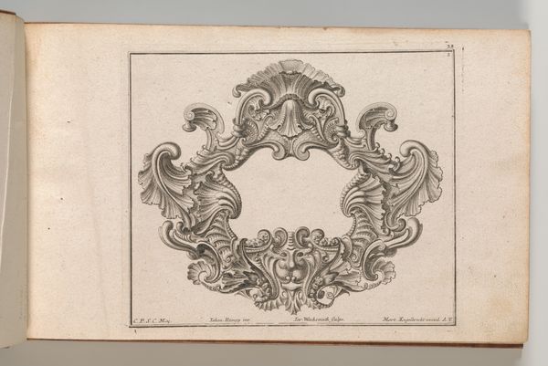
Dimensions: height 115 mm, width 150 mm, height 305 mm, width 190 mm
Copyright: Rijks Museum: Open Domain
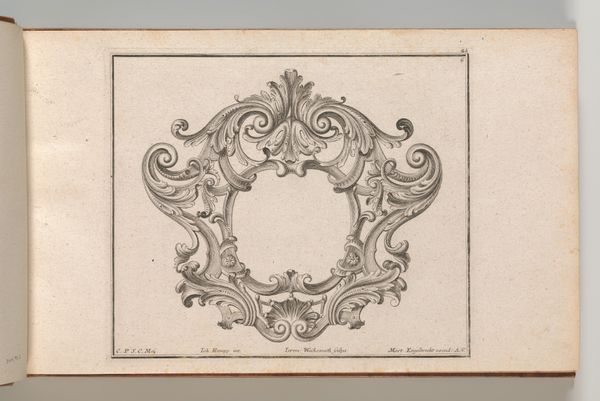
Curator: Looking at this detailed engraving, it evokes a certain formality, a rigidity of the Baroque period softened only slightly by the flourishes and foliate forms surrounding the central shield. Editor: Indeed. And the execution, the layering of ink on paper...there's an almost industrial feel despite its apparent hand-crafting, which, to me, invites a closer look at how the work was created and distributed, what workshops or studios were involved in the making. Curator: Well, let's delve into the object itself. This is a 'Cartouche voor wapenschild', a design for a coat of arms, dating back to sometime between 1630 and 1680. Currently, it is housed here at the Rijksmuseum. The creator is listed as anonymous, a circumstance not at all uncommon for the era. Consider the status of artistic labor and creative work in society then. Editor: Absolutely. The anonymous nature shifts our focus to the process. What types of presses would have been used? Where was the paper sourced, and were inks readily available or custom-mixed, controlling the depth of blacks and grays? What sort of workshops facilitated these production requirements and under which socioeconomic circumstances? Curator: In a cultural sense, these kinds of heraldic designs are often deeply rooted in patriarchal structures of power. Shields, helmets – visual symbols readily adopted by familial legacies, often exclusionary ones based on land, bloodline, and inheritance that determined societal standing for so many for so long. It speaks to the era's fascination with family lineage, gender, and societal rank. Editor: These concerns also bring up the question of class and the democratization of imagery. Were engravings such as this purchased directly by those seeking elevated rank or reproduced and appropriated by a wider class of clientele who challenged existing visual tropes. And what of the artists themselves? Where are the accounts or letters through which makers and process employees articulated an insider understanding of the work's potential as statement art or class signifier. Curator: It's also interesting how, despite the strong lines, the artist achieved a real sense of depth through meticulous shading, no? It adds to the perceived opulence. I can also see connections to theatrical traditions during this era – that Baroque extravagance feels connected to stagecraft. Editor: Yes, the meticulous technique serves its purpose of crafting a symbol for elite groups. These highly decorative emblems, made reproducible by workshops and distributed as prints, demonstrate a burgeoning art economy in service to established power and social status during this era. They’re far more than just visual design; these objects were agents within their respective society. Curator: Exactly. Thinking about how design intersected with culture is so essential, whether in early modern Europe or in contemporary life. Editor: This is just the start of the story contained in this intriguing item from the collection.
Comments
No comments
Be the first to comment and join the conversation on the ultimate creative platform.
More like this