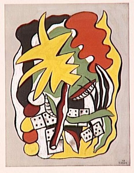
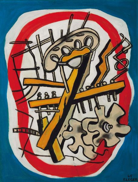
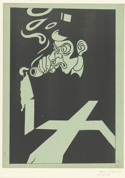
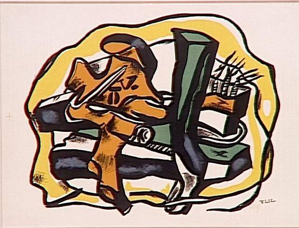
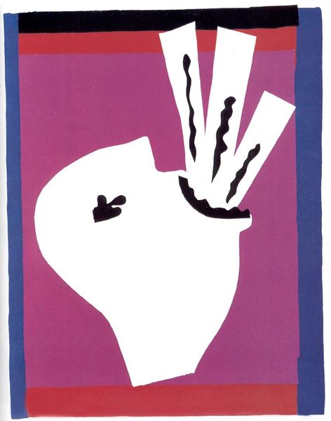
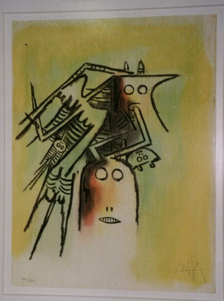
neo-pop
Copyright: Modern Artists: Artvee
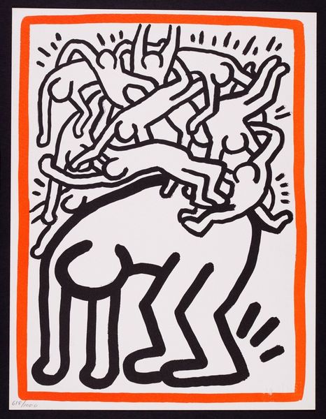
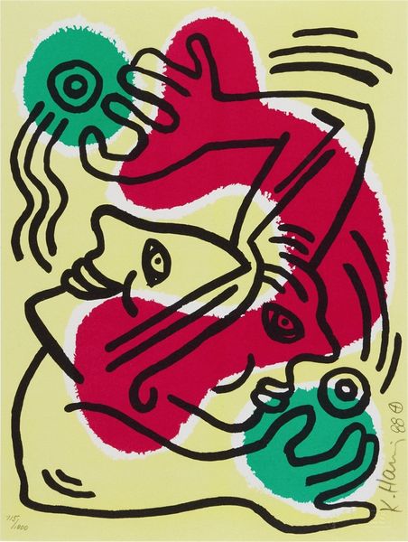
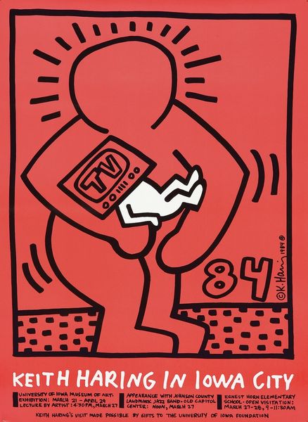
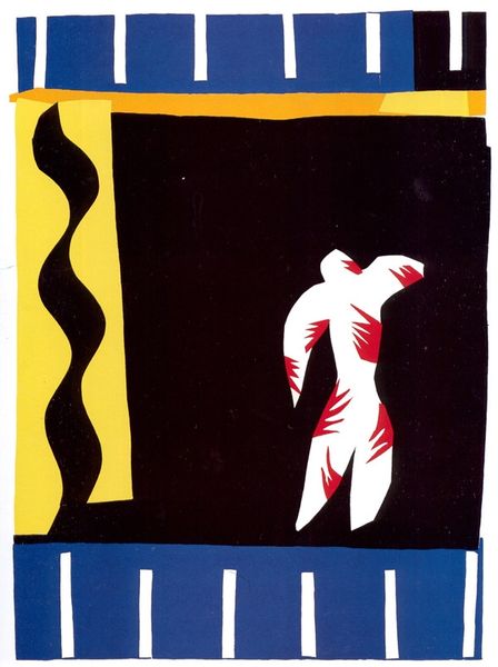
Editor: We're looking at Keith Haring's "August 1st 1991", a poster from 1989. It's vibrant and busy. The composition, with these seemingly playful figures and the Swiss flags, feels both celebratory and… a bit chaotic. What's your take on it? Curator: What I observe is a meticulous interplay of form and color, irrespective of its potential symbolic reading. The bold linearity carves out shapes within the picture plane. Note how the bright yellow of the figures contrasts vividly against the flat, verdant background, establishing an immediate visual hierarchy. What compositional strategies are employed? Editor: The figures are scattered, almost floating. But their black outlines create a sense of unity. Curator: Precisely. The linear quality that binds the work into wholeness. Even the flags themselves act as geometric interruptions in the ground, their crisp red and white offering a compelling tension against the softer curves of the figures. Let's focus not on the anecdotal, but the formal strategy behind it. Editor: So, the power lies in the structure itself, how the lines, colors, and shapes interact? Curator: Absolutely. The meaning, if we can call it that, arises from the relationship between these intrinsic visual elements, not some external narrative imposed upon it. Can you perceive of this poster, regardless of the flags? How does it hold up without the weight of context? Editor: I see it more clearly now, less about the subject and more about how Haring uses those subjects as shapes to create this energetic design. Thanks. Curator: Indeed. We've detached the signified from the signifier. A profitable exercise for an aesthete, and, potentially, ourselves.
Comments
No comments
Be the first to comment and join the conversation on the ultimate creative platform.