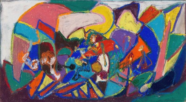
painting, acrylic-paint
#
abstract-expressionism
#
abstract expressionism
#
abstract painting
#
painting
#
acrylic-paint
#
form
#
acrylic on canvas
#
abstraction
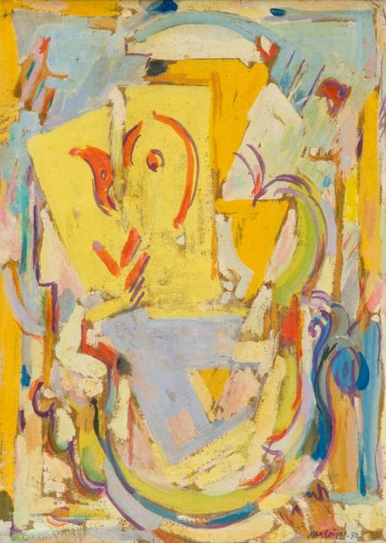
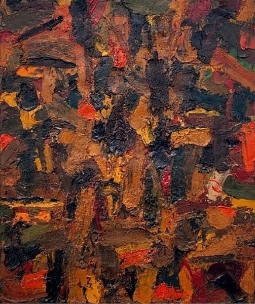
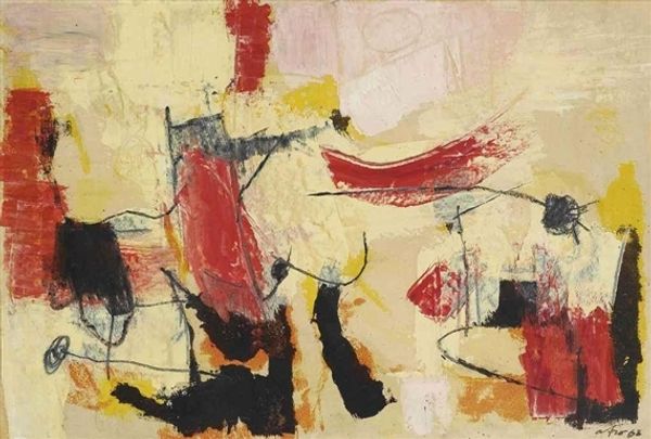
Copyright: Gene Davis,Fair Use
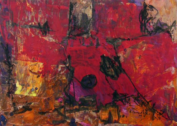
Editor: This is "Autumn" by Gene Davis, from 1955. It's an acrylic painting, and the tones feel very warm, almost rusty. The forms are vague but suggest shapes that are just out of reach of recognition. What do you see in this piece? Curator: I see a dense layering of forms and colours that generate an intriguing tension. The painting foregrounds its own materiality through visible brushstrokes. The composition avoids a central focus, promoting a reading that emphasizes all areas as equally significant. How does this formal distribution influence your interpretation? Editor: I think it keeps my eye moving across the surface, so I'm never quite settled in one place. It makes the piece feel very dynamic, despite the muted palette. Does the palette impact the composition, and do you think Davis makes deliberate choices to maintain this dynamism? Curator: Absolutely. The limited palette creates unity, while the varying tones within each hue give a subtle vibrancy, activating the surface. Consider how Davis avoids clear figure-ground relationships. This ambiguity encourages the viewer to engage with the painting's intrinsic properties – its color relationships and compositional balance – rather than searching for representational meaning. Editor: That makes sense. I was initially trying to find identifiable objects, but the painting resists that. Instead, the formal qualities become the subject itself. I had not initially grasped this effect. Curator: Precisely. Davis is interested in pushing beyond traditional representational painting and highlighting pure form. "Autumn" offers us a compelling exploration of abstract expressionism. Editor: I see it now. It's less about 'autumn' and more about the raw energy of abstract shapes and colours coming together, and creating its own autonomous existence, so to speak! Curator: An excellent assessment!
Comments
No comments
Be the first to comment and join the conversation on the ultimate creative platform.
More like this