Copyright: Rijks Museum: Open Domain
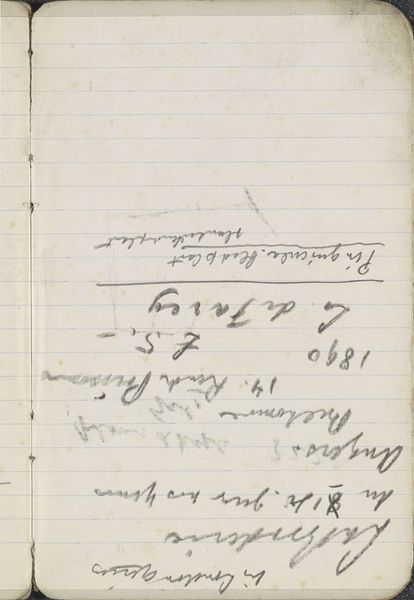
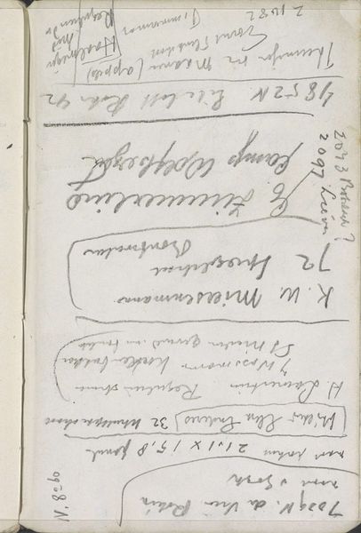
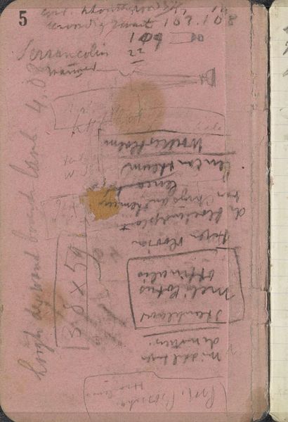
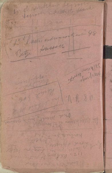
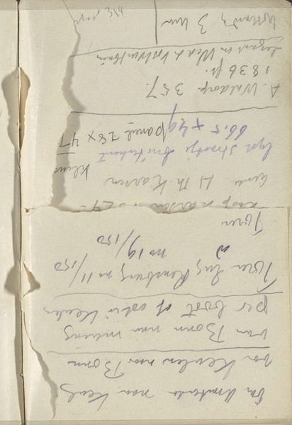
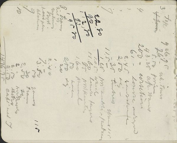
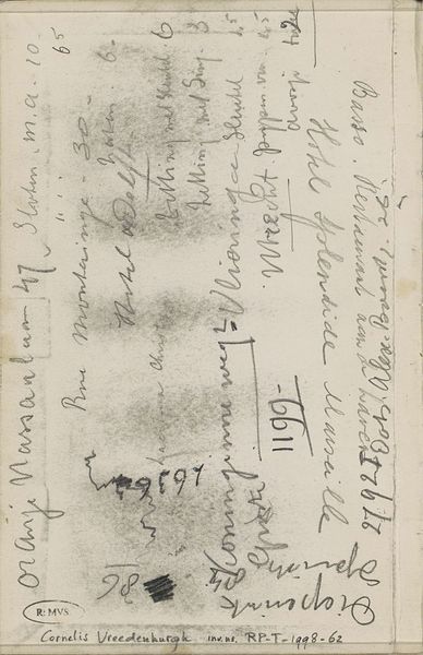
Editor: Here we have Breitner's "Annotaties" from somewhere between 1898 and 1902, a graphite drawing on paper. It's part of the Rijksmuseum collection. It's... very abstract, almost chaotic. It’s dominated by handwriting. What can you make of it? Curator: The primary element appears to be the linguistic mark. Consider how Breitner deploys text not for semantic clarity, but as a textural component. The looping ascenders and descenders of the script create a visual rhythm, counterpointed by more geometric forms. Editor: So, the content of the writing is almost irrelevant? Curator: Precisely. Its semantic meaning recedes, superseded by its formal presence. Note, also, the colour of the paper itself; a mottled pink that acts as a tonal ground against which the graphite asserts itself. Is the ground passive, or does it engage with the lines? Consider this as a question. Editor: It feels almost like the handwriting is trying to escape the page, or maybe it’s been pressed into it like an imprint. Curator: Exactly. There is dynamism inherent to its graphic arrangement. Now, to address line. Is line here mimetic or autonomous? Does it delineate something existent in the world, or is it purely self-referential, existing only as itself? Editor: I see it both ways now. Initially, I saw chaos. Now, I appreciate that even the chaotic feeling is due to his intentional arrangement of line, texture and shape. Curator: Indeed. Formal analysis reveals the degree to which the artist’s apparent disorder in reality constitutes a constructed visual language. Editor: Thanks, that’s a totally different perspective on something I thought was just scribbles. Curator: By considering purely the compositional properties, new modes of appreciation and thought are possible.
Comments
No comments
Be the first to comment and join the conversation on the ultimate creative platform.
More like this