drawing, paper, ink
drawing
non-objective-art
hand-lettering
hand drawn type
hand lettering
paper
personal sketchbook
ink
hand-written
hand-drawn typeface
intimism
fading type
geometric
abstraction
sketchbook drawing
sketchbook art
modernism
small lettering
Copyright: Rijks Museum: Open Domain
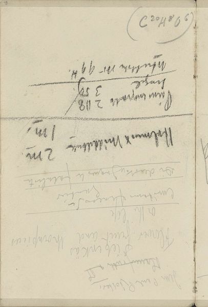
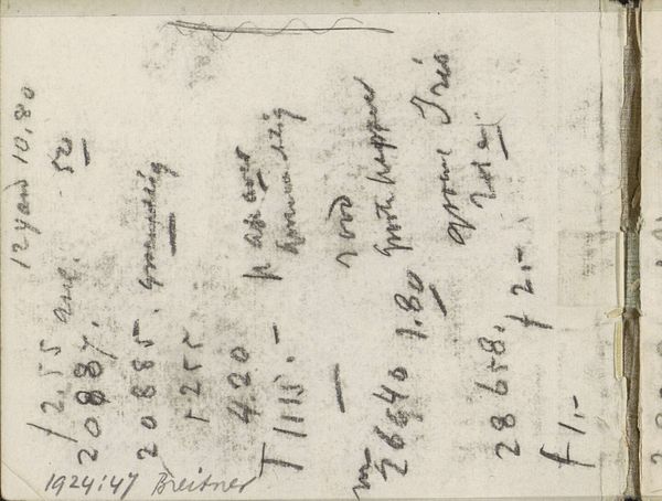
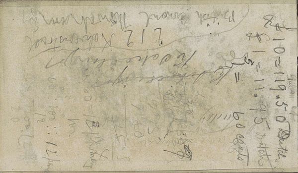
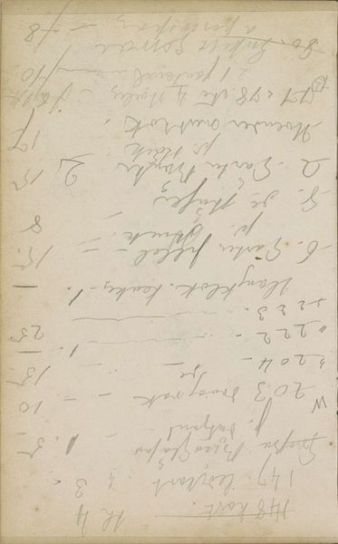
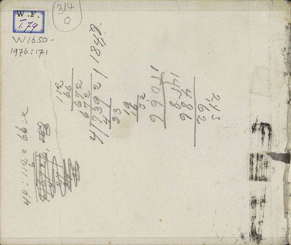
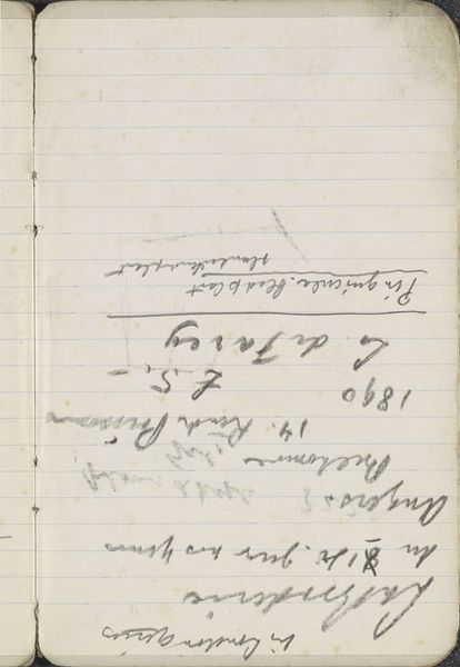
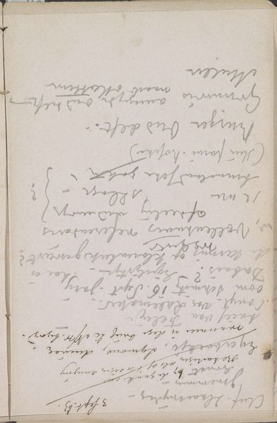
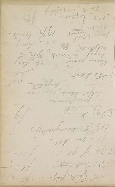
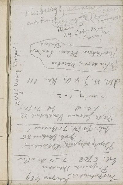
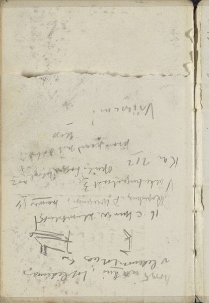
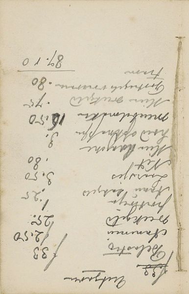
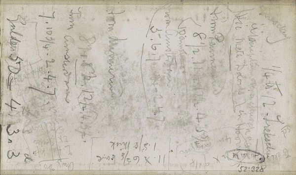
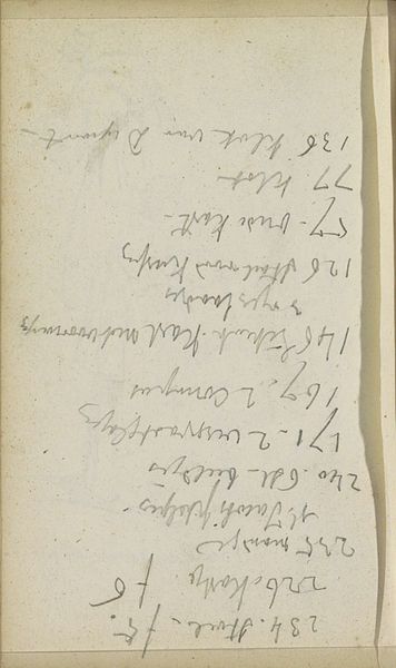
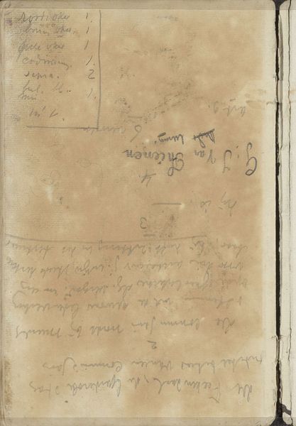
Curator: Welcome, I'm excited to discuss Willem Witsen's “Annotaties” with you. It's a page from his sketchbook, likely dating from 1915 to 1920, executed in ink on paper, and it's part of the Rijksmuseum collection. Editor: My first impression? It looks like my grocery list after a particularly chaotic trip. Curator: A perfectly understandable reaction! You see rows of numbers and almost frantic hand-lettering which form an unusual composition, a type of abstraction not commonly associated with Witsen's other works. Editor: Exactly, it departs quite a bit. He was into capturing serene landscapes, wasn’t he? This… this is the antithesis of serene. What does it all mean, all these notations? Curator: That's the delightful mystery. These aren't merely random doodles; the carefully listed amounts suggest something like accountancy. Maybe a catalog of expenditures or material measurements. Editor: So, Witsen, the famed landscape painter, was a meticulous record keeper? I suppose even artists have to deal with the mundane reality of expenses. It makes him a bit more relatable. Curator: Intimism is part of this drawing; It lets us intimately view something of his everyday life. Beyond just numbers, consider the energy conveyed. Witsen's quick strokes reflect the moment-to-moment reality that shaped his life during those years. Editor: It is revealing; perhaps art doesn’t always have to be about grand statements. Sometimes, the small details, these annotated scraps, tell the bigger story. Thank you. Curator: I’m so pleased you pointed that out—art thrives when approached both viscerally and thoughtfully.
Comments
No comments
Be the first to comment and join the conversation on the ultimate creative platform.