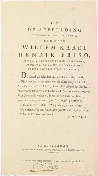
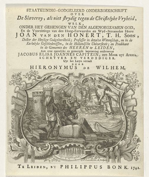
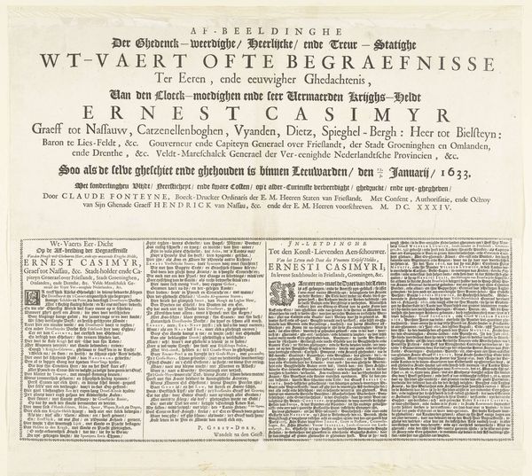
graphic-art, print, engraving
#
graphic-art
#
aged paper
#
dutch-golden-age
# print
#
text
#
paragraph style
#
personal sketchbook
#
journal
#
stylized text
#
thick font
#
handwritten font
#
word imagery
#
engraving
#
historical font
#
columned text
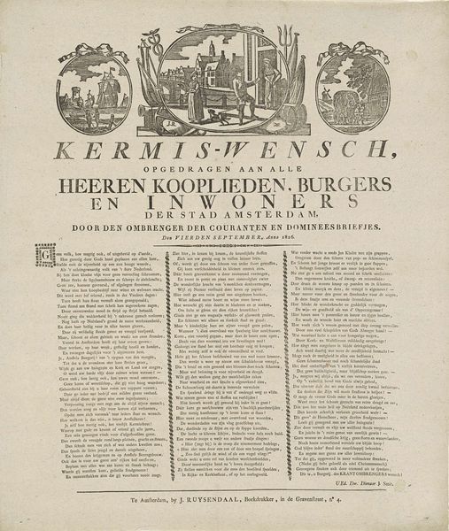
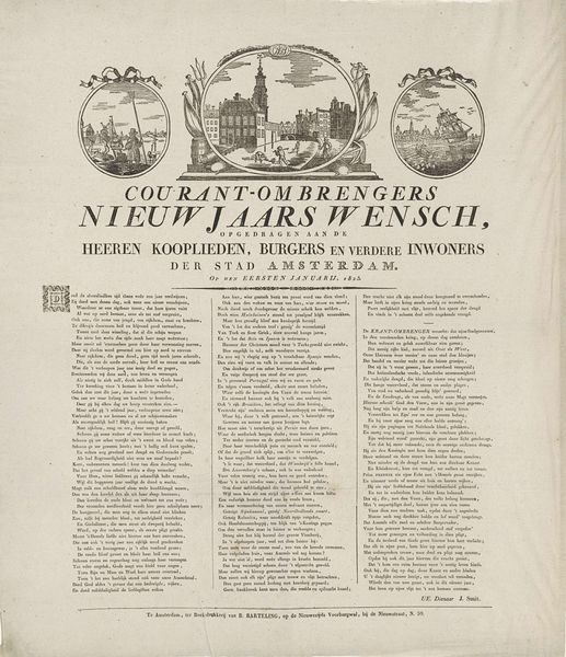
Dimensions: height 523 mm, width 455 mm
Copyright: Rijks Museum: Open Domain
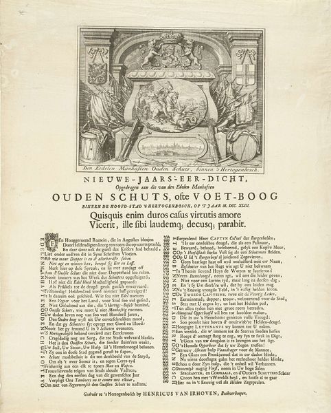
Editor: This is "Kermisprent van de Amsterdamse courantombrengers voor het jaar 1825," a print from 1825. It’s an engraving filled with dense text and small illustrations. It looks like a broadside, something meant to be distributed. What strikes me is the way the text dominates the composition; the imagery almost seems secondary. What do you see in it? Curator: I see an intriguing interplay of textual and visual elements, conforming to its medium and function. Let's focus on the structure: three circular vignettes surmount a dense block of text, unified by the consistent engraving technique. The typography itself becomes a significant visual component. Consider the contrast between the large, bold title and the smaller, closely packed text beneath. Editor: Right, the font choices create a hierarchy of information. But the illustrations seem a bit disconnected from the text itself, like separate visual commentaries. Are they deliberately placed, or is it more about filling the space? Curator: The placement, while seemingly disparate, adheres to a structural logic. Note the mirroring effect, ship on the left, building with crowd in the center and landscape with structure on the right: the vignettes anchor the composition and provide visual relief from the dense text, but through its very placement and mirrored images invite a contemplation on narrative linkages between image and textual description. Do you note anything in how this formal layout impacts your perception of the artifact’s purpose? Editor: I think seeing the symmetrical layout and the considered font choices make it feel more considered, like a formal announcement than just a street flyer. Thanks, that's a helpful way to think about the piece! Curator: Indeed. By recognizing how formal choices create coherence, even amidst visual and textual variety, one appreciates how prints such as these were designed not just to inform, but also to engage the viewer aesthetically and intellectually.
Comments
No comments
Be the first to comment and join the conversation on the ultimate creative platform.
More like this