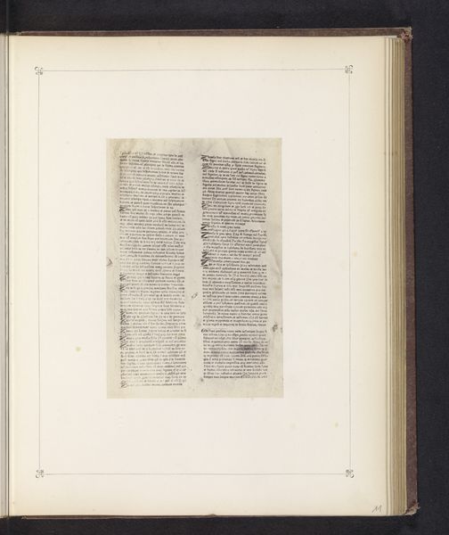
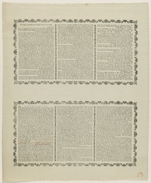
Uitgeversprospectus 'Idée de la Gravure', prenten van M. de Marcenay de Ghuy 1734
0:00
0:00
print, engraving
#
baroque
# print
#
old engraving style
#
text
#
engraving
Copyright: Rijks Museum: Open Domain
Curator: Ah, here's an intriguing piece! It’s a print called "Uitgeversprospectus 'Idée de la Gravure', prenten van M. de Marcenay de Ghuy," or roughly translated, "Publisher's Prospectus 'Idea of Engraving', prints by M. de Marcenay de Ghuy." It's an engraving that dates back to 1734. What springs to mind when you see it? Editor: Well, immediately, it feels very dense. Almost oppressive, really, just walls of text! There's a certain ornate quality to it though, despite the overwhelming feeling. It almost feels like staring into a lost world preserved on the page. Curator: You've hit upon something essential. The "oppressive" feeling comes from its function – it's essentially a sales brochure. Marcenay de Ghuy was promoting his engravings and outlining his artistic philosophy, cramming as much information as possible onto one page to entice potential buyers. That density mirrors the overwhelming ambition of the project itself. Editor: It's fascinating how marketing manifests aesthetically. So, the intricate border around the text – is that also part of the Baroque style at play? There's something slightly unsettling in how controlled yet wild it is. Curator: Absolutely. The Baroque influence is evident in the ornamentation and the sheer exuberance. The border, that cartouche at the bottom—it’s designed to elevate what would otherwise be a simple text block, signaling value and artistic sophistication. The engraving medium itself lends an air of precision and detail fitting for a document intending to convey important information. Editor: I'm drawn to that interplay between control and freedom. It almost reflects the internal push and pull between artistic inspiration and commercial constraints. I find that interesting. Knowing it’s effectively advertising elevates it; there is commentary laced in here. Curator: Exactly! The symbolism and visual language elevated even mere marketing to a complex form of art itself. The artist’s hand and aesthetic presence is apparent here despite this being purely promotional material. What a treasure. Editor: Right, the idea that cultural and artistic value can thrive where we least expect it. Thank you for that dive into an otherwise unassuming image; this old text block truly held some secrets.
Comments
No comments
Be the first to comment and join the conversation on the ultimate creative platform.
More like this