Dimensions: height 378 mm, width 235 mm
Copyright: Rijks Museum: Open Domain
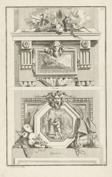
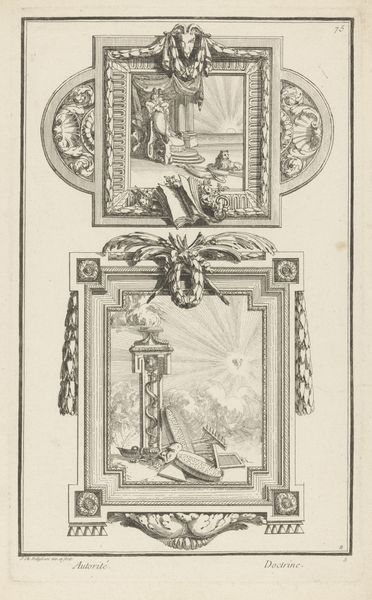
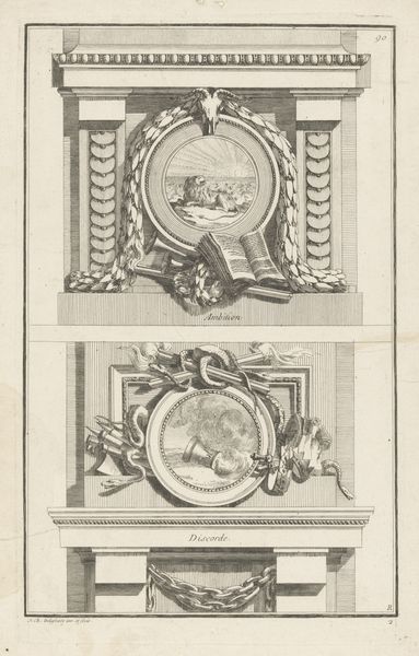
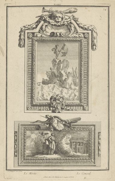
Curator: Welcome. Here we have "Fantasie en tegenstelling," or "Fantasy and Opposition," an engraving by Jean Charles Delafosse, created between 1768 and 1771. The artwork presents two stacked decorative structures, full of intricate details. What's your initial impression? Editor: Bleak! My eyes keep circling, searching for a single source of illumination in what feels like an architecturally designed nightmare. Curator: Nightmarish is a strong word! Let's break it down. Delafosse was known for his decorative prints. This piece, an engraving, meticulously renders classical motifs and allegorical figures within a structured, almost architectural framework. Note the precision of line and the balance achieved through symmetry, typical of Baroque decorative arts. Editor: But the themes! The title itself promises "opposition." The top structure, titled "Caprice," seems playful at first— cherubic figures, swirling garlands—but then you see the death mask adorning the vase, the snake slithering by a barren landscape on that odd medallion. It’s all subverted! It speaks to a crisis of meaning. Curator: I see it more as a study in contrasting elements within a controlled design. Delafosse is playing with form. For example, notice how the circular medallion of "Caprice" mirrors the octagonal frame of "Contrarité" below. These are not mere illustrations but explorations of shape and space. Editor: But shouldn’t we ask *why* these forms are arranged as they are, and *what* is at stake here? The lower structure, “Contrarité,” with its grotesque mask, scythe, and burning chalice is openly aggressive! How does the artist use gender in the stony mask? Is he celebrating masculine intellectual labor or ironically critiquing a self-serving agenda? These decorations would've been used in spaces for elite people of power after all. Curator: While those questions have value, it's critical to note the artistry of execution here. Observe how the light falls across the planes, creating depth and texture. The medium itself – the engraving – requires enormous skill and control. Look at how delicate each line is. The image offers so much. Editor: And the context demands that we ask *why* this visual rhetoric takes this shape, specifically! Looking at this piece today prompts crucial inquiries regarding cultural control. To really *see* "Fantasie en tegenstelling" fully means questioning every visual signal. Curator: Ultimately, the work embodies its title – a push-and-pull of fantasy and opposition, order and chaos—a reflection of the complexities inherent to the period it was created in. Editor: Exactly. The questions we raise now shed some light, after all, in this designed visual darkness.
Comments
No comments
Be the first to comment and join the conversation on the ultimate creative platform.
More like this