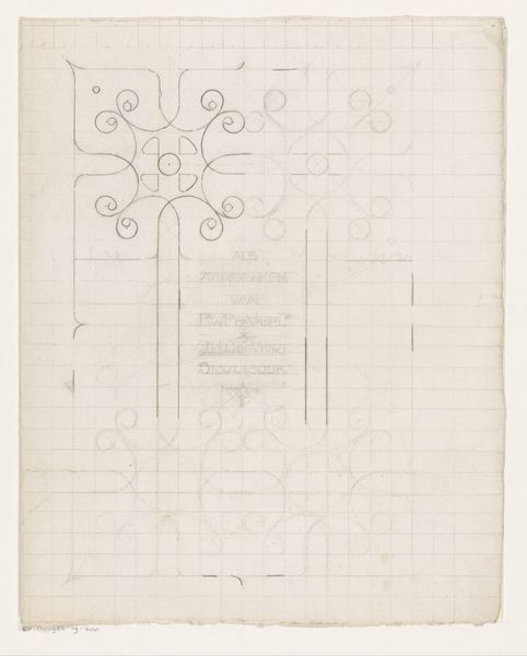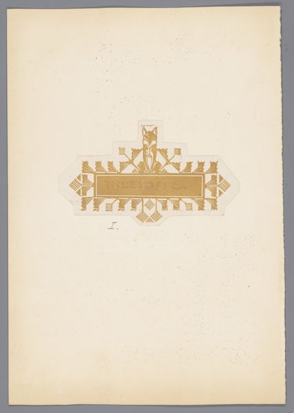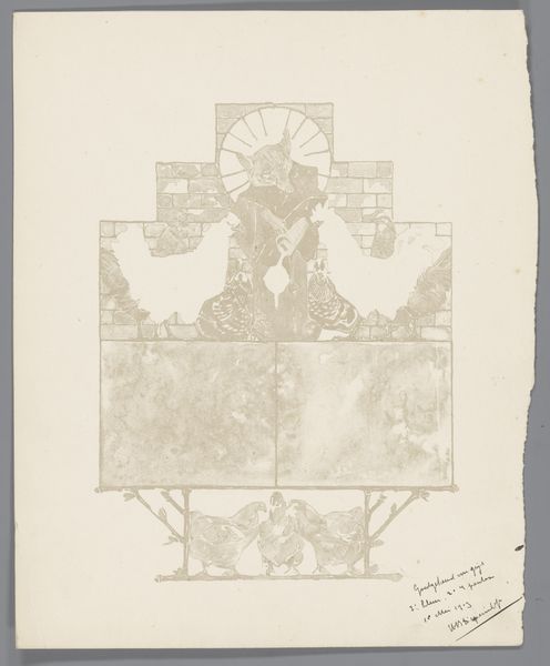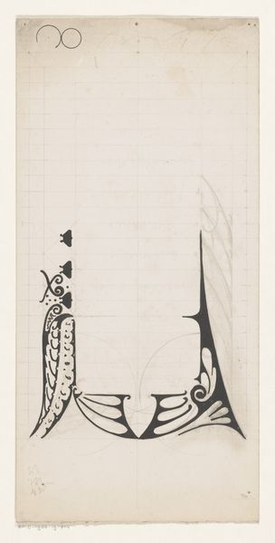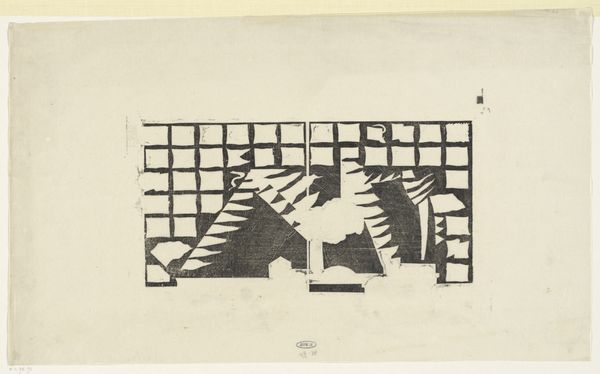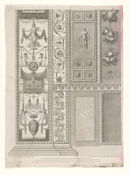
Ontwerp voor titelpagina voor: Stijn Streuvels, Reinaert de Vos, 1910 c. 1910
0:00
0:00
bernardwillemwierink
Rijksmuseum
drawing, graphic-art, paper, typography, ink
#
drawing
#
graphic-art
#
art-nouveau
#
paper
#
typography
#
ink
#
geometric
#
line
Dimensions: height 290 mm, width 235 mm
Copyright: Rijks Museum: Open Domain
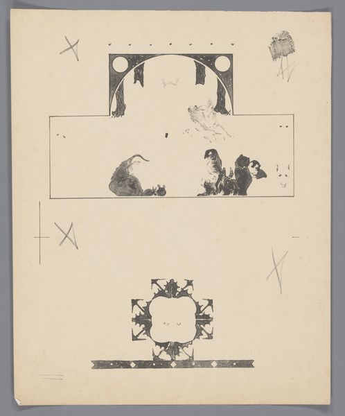
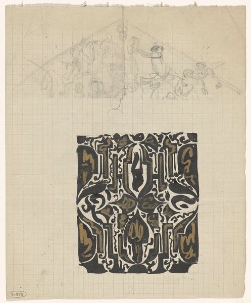
Bernard Willem Wierink made this title page design for Stijn Streuvels's book, Reinaert de Vos, around 1910. Look at how the ink is applied. There's a real sense of the hand, of the tools dragging and blotting. It’s art making as a conversation, a process unfolding. The texture is fascinating, isn't it? The ink isn't just flat; it's built up in places, almost sculptural. See that dark, blobby shape at the top left? It’s like a Rorschach test. The marks aren't trying to hide their making; they're kind of flaunting it. It makes me think about how we construct images, how we piece things together from fragments and impressions. This piece reminds me a little of Odilon Redon, in that both were printmakers, and both evoke a sense of the uncanny and the symbolic through very simple means. Ultimately art is about asking questions, about embracing ambiguity and celebrating the endless possibilities of interpretation.
Comments
No comments
Be the first to comment and join the conversation on the ultimate creative platform.
