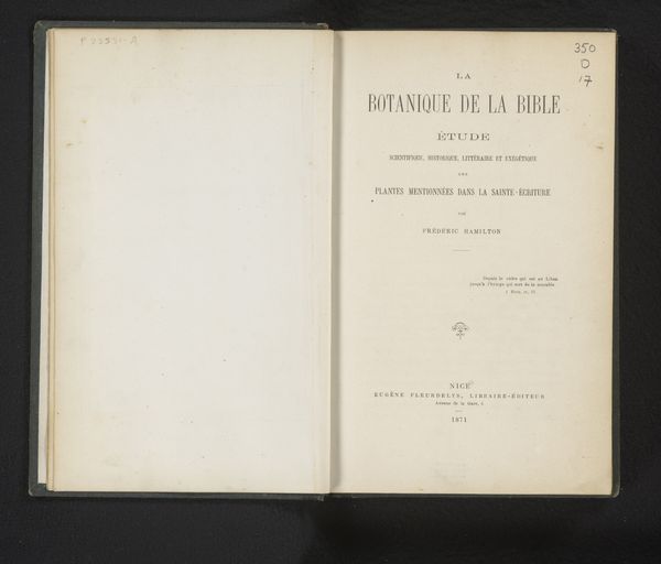
Fabrication et mise en oeuvre du papier de du carton / Royaume de Belgique, Ministère de l'industrie et du travail, Office du travail et inspection de l'industrie 1906
print, paper, typography
script typeface
aged paper
paperlike
personal journal design
paper
personal sketchbook
typography
hand-drawn typeface
thick font
handwritten font
delicate typography
thin font
Dimensions: height 252 mm, width 167 mm, thickness 12 mm
Copyright: Rijks Museum: Open Domain
Curator: This open book has an intriguing sense of formality. It is a title page from 1906, bearing the title, "Fabrication et mise en oeuvre du papier de du carton," or, "Manufacturing and implementation of paper and cardboard". Editor: It’s aged like a love letter, all delicate script and muted tones. There’s a feeling of quiet industry embedded within these pages; a nod to a Belgium concerned with manufacturing. Curator: Absolutely. It originates from the Belgian Ministry of Industry and Labor, an interesting vantage point when considering this work today. Notice the deliberate typography, the hierarchy established through font size and style. It all speaks to the careful categorization inherent in industrial practices. The seal adds to the impact. Editor: Seals always carry significance. Here, the Belgian coat of arms grounds the text in a particular social and political context. Given the association with both industry and labor, I’m prompted to consider the working conditions of the time and the implications of categorizing knowledge about these industries in such a manner. Was this information accessible to all? Curator: It speaks to an emerging sense of standardization, codifying and disseminating knowledge, presumably for industry insiders. Consider the symbolic weight of presenting this under a national symbol. It ties manufacturing processes directly to Belgian identity. Editor: Right. The imagery becomes a silent declaration about national interests, especially in the era of industrialization when national prosperity became so overtly connected to economic prowess. One almost wonders who got to craft that image. It's intriguing how symbols can be used to reinforce power structures. It makes me think about who is being recognized, whose work is being honored, and conversely, who is erased. Curator: It prompts us to remember how documents, seemingly straightforward, are filled with subtle messaging and layers of encoded information. Even the choice of typeface carries meaning beyond the purely functional. The aged quality of the paper only enhances that sense. Editor: Agreed. This image feels less about paper and cardboard, but instead speaks to power, categorization, and control over industrial practices and in its quiet, aging way reminds us how documents themselves participate in larger narratives of nationhood and the distribution of labor. Curator: I concur. A humble page, rendered weighty with cultural and political meaning.
Comments
No comments
Be the first to comment and join the conversation on the ultimate creative platform.