graphic-art
#
graphic-art
#
typography
#
constructivism
#
form
#
geometric
#
abstraction
#
line
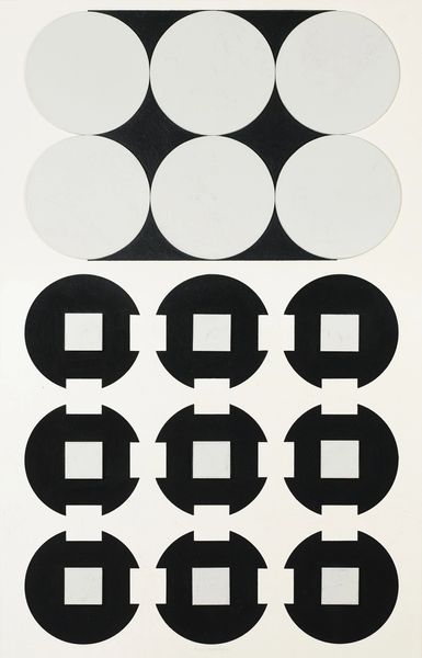
Copyright: Henryk Berlewi,Fair Use
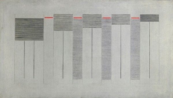
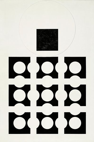
Curator: Take a look at Henryk Berlewi's "Kontrasty Mekanofakturowe" from 1924, a striking piece of graphic art. What's your first take? Editor: My first impression? It’s like a visual symphony of progress. The rising bars remind me of a city skyline in full industrial bloom, those dark shapes against a stark, neutral background. There’s an exciting mechanical energy. Curator: It certainly speaks to the avant-garde spirit of the time. Berlewi was deeply involved with Constructivism, an art movement which was all about embracing industrial materials and celebrating the machine age. You can really see that reflected here. Editor: Absolutely! And I think what strikes me most is the considered balance, everything feels calibrated. The circles provide a softer contrast to the hard-edged geometric shapes. There is something very deliberate about that combination. Curator: It’s more than just shapes, though, isn’t it? Think about how this work engaged with contemporary Polish society. Berlewi called this composition "Mechanofacture" in his attempt to create purely abstract art that mirrors industrialization’s relentless march, a stark contrast to Romantic landscapes and folklore-infused paintings favored at that time. He's practically suggesting we build a new world from scratch. Editor: He sure is! I appreciate the fact that even within a seemingly rigid system, he leaves room for subtle visual variations in line weight and spacing. That keeps the eye engaged, allowing for the individual interpretation and the pure expression of an idea, not just slavish representation. Curator: And remember this wasn't just for galleries; artists of the era really did want to integrate art into every aspect of daily life, posters, banners, graphic design for advertisements… They viewed art as functional. It needed to inspire people to rebuild and redefine everything. Editor: Thinking about it now, it feels like an old blueprint of the future that’s got both simplicity and audacity. Seeing this work really drives home how artists can act like social seismographs, pointing to seismic shifts that society will undergo. Curator: Exactly. It is not just about geometric shapes—but about the shifting realities in interwar Poland. Editor: Well, it definitely puts things in perspective! Curator: It’s a work that really encapsulates the bold ambition and spirit of reinvention characteristic of that time.
Comments
No comments
Be the first to comment and join the conversation on the ultimate creative platform.
More like this