Copyright: Sol LeWitt,Fair Use
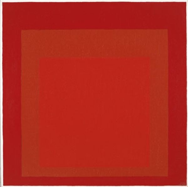
Sol LeWitt made this screenprint, A Square With Colors Superimposed Within a Border, using flat, unmodulated color. It’s a simple geometric composition: a square within a square, delineated by a border. The materiality of the work is straightforward. The surface is smooth and even, the colors clean and distinct. Look at the way the central orange square sits against the cool green border. The colors don't blend or bleed, but butt right up against each other. It's so precise, so controlled. That border creates a sense of containment, a frame for the interaction of colors. It reminds me of Josef Albers, who was a master of color relationships. Like Albers, LeWitt is exploring how colors shift and change depending on their context. Even with such a simple form, the possibilities feel endless. It’s an invitation to slow down and really *see*.
Comments
No comments
Be the first to comment and join the conversation on the ultimate creative platform.
More like this