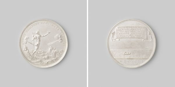
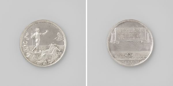
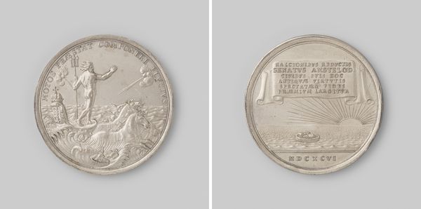
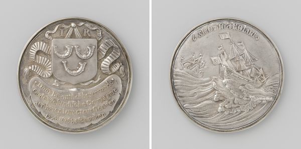
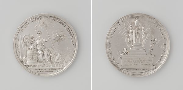
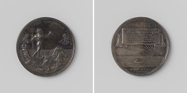
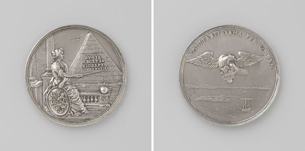
Op de demping van het aansprekersoproer te Amsterdam naar aanleiding van de keur op het begraven 1696
0:00
0:00
metal, engraving
#
portrait
#
allegory
#
baroque
#
metal
#
geometric
#
history-painting
#
engraving
Copyright: Rijks Museum: Open Domain
Editor: This is a metal engraving titled "Op de demping van het aansprekersoproer te Amsterdam naar aanleiding van de keur op het begraven," created by Reynier Arondeaux in 1696. The contrast between the relief figures and the smooth surface of the metal is quite striking, isn't it? What catches your eye when you look at this piece? Curator: Indeed. Formally, I’m immediately drawn to the composition. Note the careful division of space into distinct zones: the dynamic figural grouping on one side, and the ordered inscription and radiant motif on the other. How does this structured organization inform the viewer's perception of the piece's central theme? Editor: It's like two different perspectives in conversation. On one side, a tumultuous sea and on the other a calm resolution? Curator: Precisely. Observe how the lines and forms converge and diverge. The dynamism in Neptune's stance contrasts with the calculated arrangement of the inscription. Can we appreciate how these formal strategies enhance and shape our encounter with the artwork, rather than focusing on its purported historical context? Editor: So, the visual language itself becomes the message? Curator: One might say. The very texture of the metal, the way the light plays on the raised surfaces, all contribute to a tangible sense of order emerging from potential chaos. What about the choice of geometric forms? How do those affect your understanding? Editor: I see. The contrast creates a balance that seems very intentional. I thought the scene had more importance, but I now see the text balance it out. Curator: Indeed, that play of contrasting forms creates a piece far more interesting and visually arresting. A masterful application of form and medium! Editor: Thanks! I see the artwork through an entirely new lens. The arrangement creates a dialogue with the materials themselves.
Comments
No comments
Be the first to comment and join the conversation on the ultimate creative platform.
More like this