ink
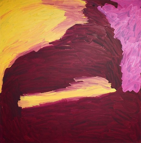
abstract expressionism
abstract painting
food
possibly oil pastel
ink
fluid art
pink
acrylic on canvas
paint stroke
watercolour bleed
impressionist inspired
watercolor
swirly brushstroke
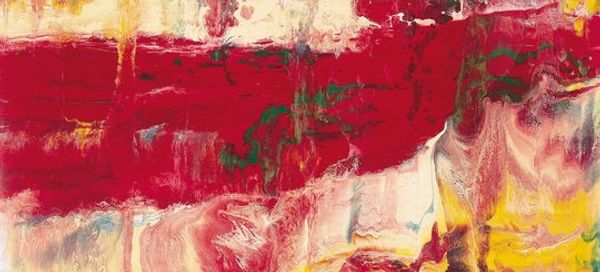
Copyright: Albert Irvin,Fair Use
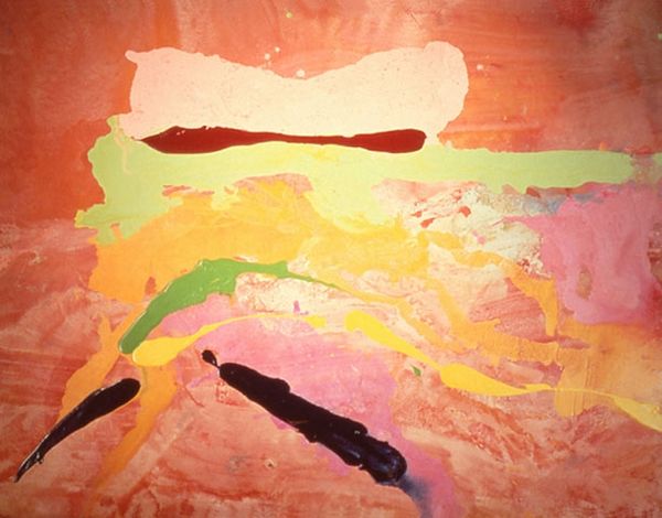
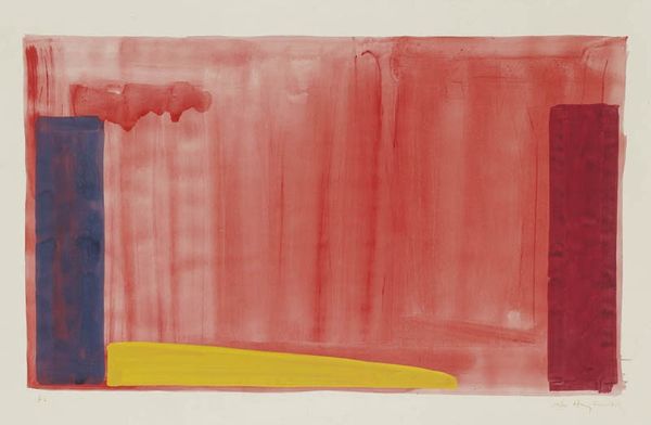
Albert Irvin made "Parade" with what looks like watercolour or very thin acrylic, and with a loose, wet-on-wet technique. It feels like he's letting the colours bleed and blend, embracing the unpredictable nature of the medium. The painting is mostly red, a kind of bricky, earthy red, but it’s got these juicy puddles of color along the top – a vibrant pink, a muddy green, and a sunny yellow. The texture is smooth, almost like a stain, with thin washes of color creating layers and depth. You can see how the paint moves, the directions of the brushstrokes, like watery tracks. The overall effect is dreamy, atmospheric, almost like looking at a sunset through a hazy filter. It reminds me a little of Helen Frankenthaler's soak-stain paintings, where color becomes this all-enveloping environment. Ultimately, "Parade" isn't about telling you what to see, but about inviting you into a world of pure, unadulterated color and feeling.
Comments
No comments
Be the first to comment and join the conversation on the ultimate creative platform.