Copyright: Public Domain: Artvee
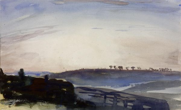
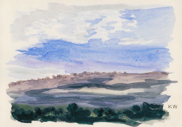
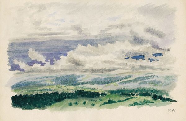
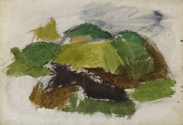
Editor: This watercolor painting, titled "Landschaft" by Karl Wiener, was created in 1943. The rolling hills create a peaceful, almost melancholy mood for me. What do you see in this piece from a formal perspective? Curator: Note how Wiener divides the landscape into distinct, almost geometric planes of color. The composition uses a limited palette – earth tones, greens, greys – but the subtle variations within those hues create depth. Consider the materiality of watercolor. How does the transparency of the washes contribute to the overall effect? Editor: The layering of the watercolor makes the hills look soft. Curator: Precisely. The lack of hard edges and defined lines softens the form, drawing attention to the transitions between planes. How do these formal elements shape your experience of the landscape? Does the arrangement generate an emotional response? Editor: It does make it feel quite calm, almost muted. The hazy sky adds to that effect, because there aren’t defined contrasts or saturated colors. It isn't a photorealistic landscape, though; the planes are simplified and emphasize abstraction. Curator: Yes, Wiener favors abstract visual qualities over naturalistic details, emphasizing line and texture, not just mimesis. He creates structure with planes of color and receding hills and minimizes surface detail, drawing our attention to color saturation and contrasts in the visual design. The mood is one of tranquil melancholy, as you mentioned, built largely through compositional techniques and material employment. Editor: So by abstracting the scene, Wiener focuses more on visual features like texture and hue, to generate emotional responses. That makes me consider watercolor as not just a means of representation, but a means of conveying emotion. Curator: Precisely! It invites a more considered look at watercolor and reminds us that form truly informs content.
Comments
No comments
Be the first to comment and join the conversation on the ultimate creative platform.
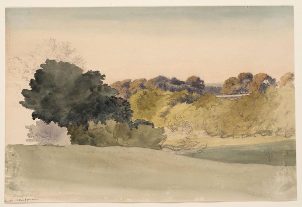
More like this