Dimensions: height 201 mm, width 271 mm
Copyright: Rijks Museum: Open Domain
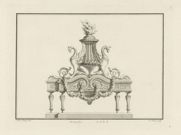
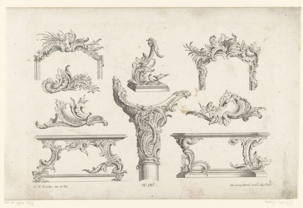
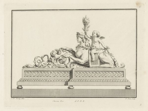
Curator: So, let's delve into this engraving: Augustin Foin's "Vuurbok met leeuw," created somewhere between 1775 and 1790. It’s held here at the Rijksmuseum. Editor: Whoa, a fiery lion tamed into…decorative art! It's like a majestic beast agreeing to model for a fancy photoshoot. A slightly grumpy photoshoot, if you ask me. Curator: The "fire dog," as it translates, immediately places the object within a context of domesticity, specifically hearth and home. Lions often symbolize power, but their application to this rococo design of a fire dog perhaps illustrates the control and domination over wilder tendencies characteristic of the elite. Editor: Absolutely. It also screams "Versailles" to me. So over-the-top, so needlessly extravagant! And that's kinda why I love it. It's beautifully rendered – look at the detail in the lion's mane! You can almost feel the heat radiating off it. Curator: Indeed. Considering the context of late 18th-century Europe, engravings like this were integral to disseminating artistic styles. Mass production allowed designs to influence craftspeople far from the royal courts. Think of how notions of power, luxury, and aristocracy became democratized and interpreted differently across social strata. Editor: Ah, yes. But on a simpler note, couldn't it be just someone, possibly with nouveau riche sensibilities, who deeply loves lions wanting one of these fireplace adornments for their very own mantelpiece? I guess it's the audacity that strikes me the most; taking such an ancient symbol and repurposing it for home décor. Curator: Perhaps, yes. This work provides insight into a world on the cusp of revolution, visually highlighting tensions between wealth, symbolism, and accessible aesthetics. The Rijksmuseum states that it's made of metal, but obviously, what we have here is only an image. It must have been an extravagant objet. Editor: It also strikes me, seeing it represented like this, how we flatten an object's tactile impact for the purposes of design sharing. Almost takes away the point of it somehow. Well, almost! Still gorgeous. Curator: Ultimately, studying this object through an intersectional lens challenges notions of high and low art and provides space to think about historical perspectives of accessibility in arts. Editor: It makes you wonder what wild, decorative statements we will be making in the future and how future generations will analyze us for them!
Comments
No comments
Be the first to comment and join the conversation on the ultimate creative platform.