Copyright: CC0 1.0
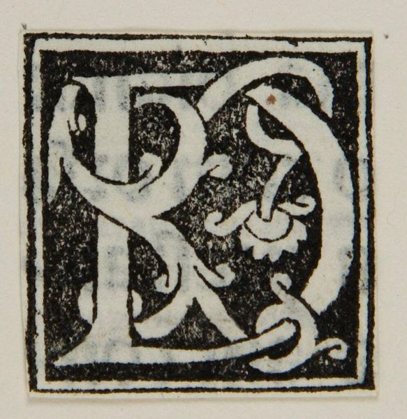
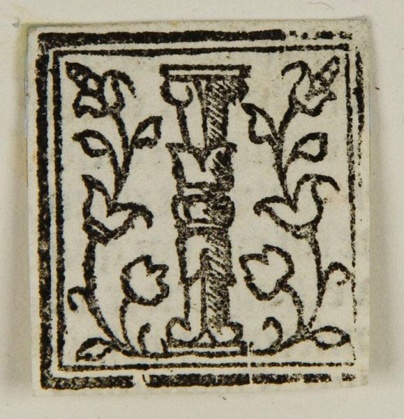
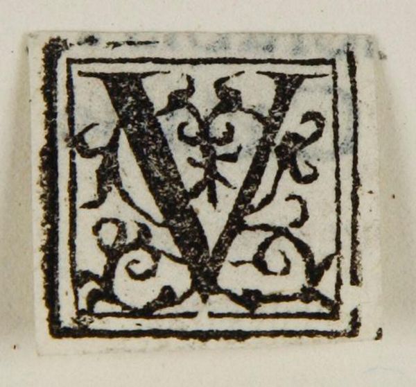
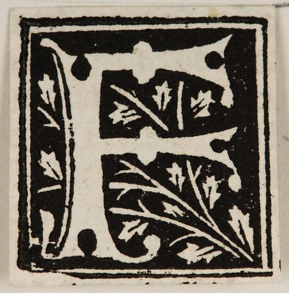
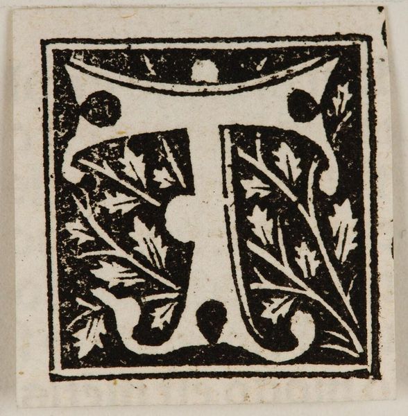
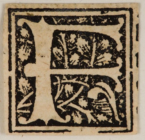
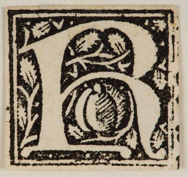
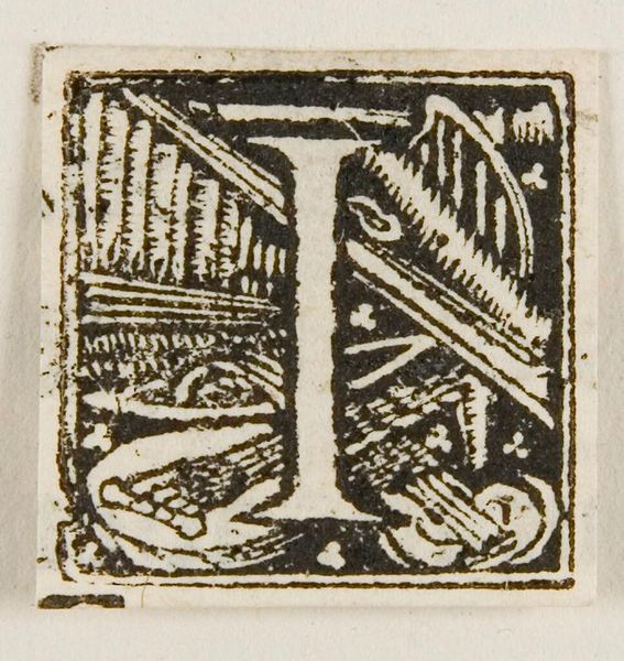
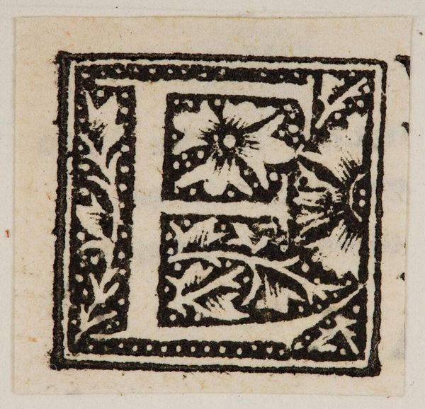
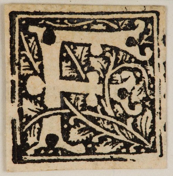
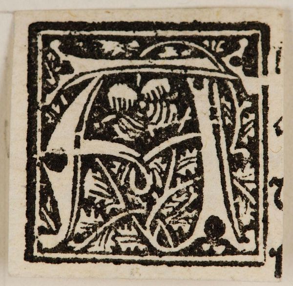
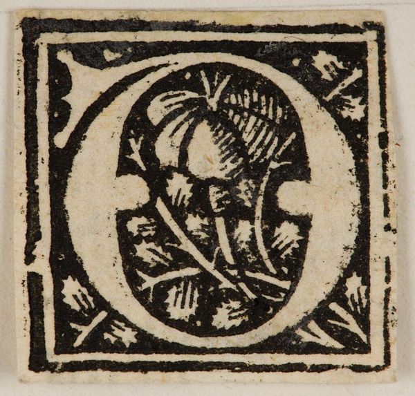
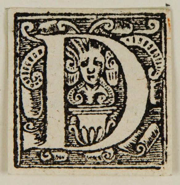
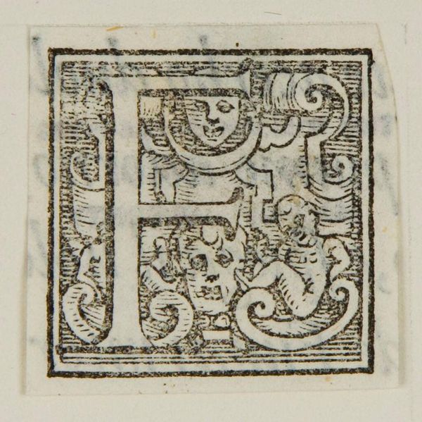
Curator: There's something powerful about the Capital A in this anonymous print held in the Harvard Art Museums. Immediately, I'm struck by the starkness of it all. It feels almost primal, doesn't it? Editor: Yes, primal in the sense that typography helped democratize texts and ideas. The heavy black ink and bold geometric shape give it such authority, and yet the floral interior softens that. Curator: Exactly, it's a fascinating tension. It's as if the letter itself is a garden overgrown, a wild starting point. Maybe it reflects the messy, complex roots of knowledge itself? Editor: Perhaps, but it's also important to remember that initial capitals like this were often part of larger printed works, intended to signal importance, maybe even class and wealth. Curator: I can see that. Still, I prefer to think of this A as a portal. A doorway to imagination where every story begins. Editor: I suppose it depends on how you read the history of access. Anyway, it's certainly quite the letter. Curator: Indeed, a potent symbol to ponder.
Comments
No comments
Be the first to comment and join the conversation on the ultimate creative platform.
