print, photography
# print
#
photography
#
history-painting
#
academic-art
Dimensions: height 249 mm, width 178 mm, thickness 3 mm
Copyright: Rijks Museum: Open Domain
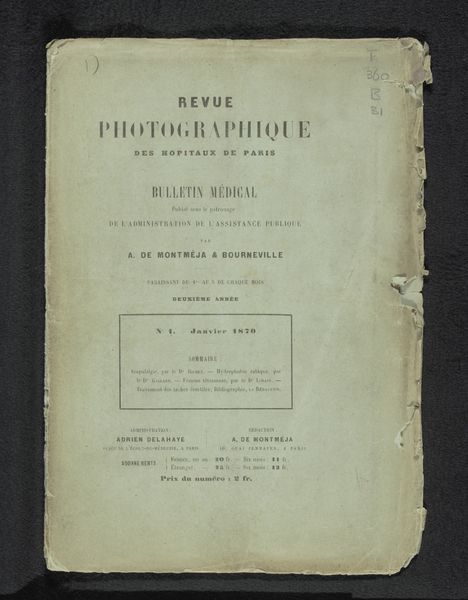
Editor: Here we have the “Revue photographique des hôpitaux de Paris,” dating back to 1870. It seems to be a print of a photographic journal cover by A. de Montméja. The typography feels very formal and ordered. What do you make of the composition and the overall design choices? Curator: Note how the emphasis on typographic hierarchy creates distinct zones of information. Observe the contrast between the large, bold title and the smaller, more delicate text of the publishing details. Consider the way the designer has used the negative space surrounding these text blocks. This visual rhythm guides the eye, communicating a clear and structured message. Does the paper texture inform the way the image's composition strikes you? Editor: The aging paper lends a certain gravity. I guess it speaks to its history as a physical object. It feels less like a digital image and more like something handled and read. Curator: Precisely. The material itself contributes to the aesthetic. We also have to acknowledge the imperfect registration of the print, adding an unintended, textural element. Editor: I hadn’t considered that imperfection as a feature. Curator: Its aesthetic implications enrich its meaning and underscore that it exists both as a text and as a reproducible document. The details of construction create another way for us to look. Editor: This close attention to textual relationships and materiality really illuminates aspects I had not initially appreciated. Curator: Thinking about image structure expands our understanding of the publication as an aesthetic achievement in itself.
Comments
No comments
Be the first to comment and join the conversation on the ultimate creative platform.
More like this