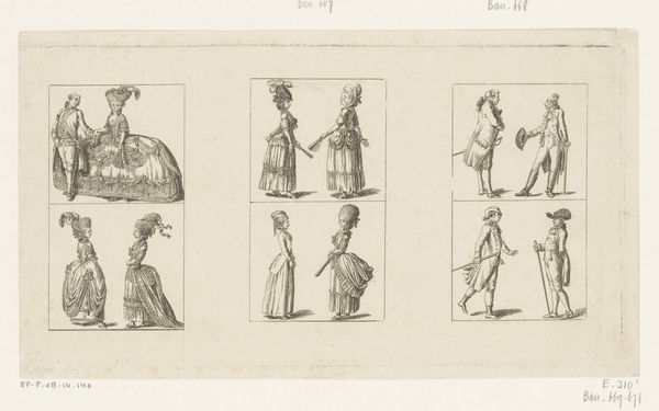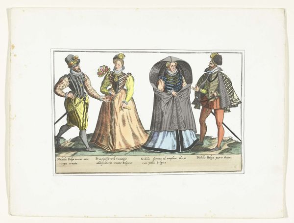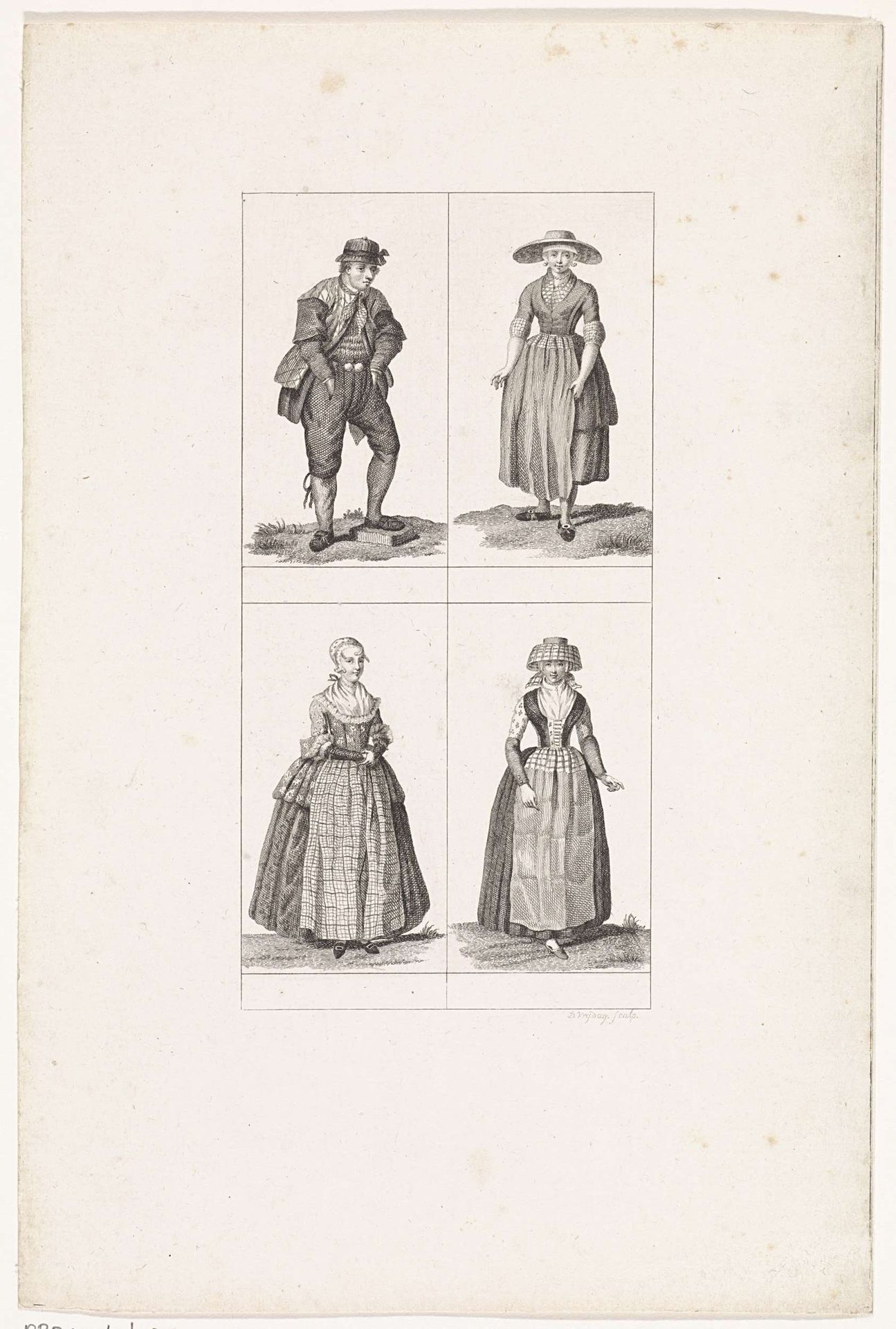
1791
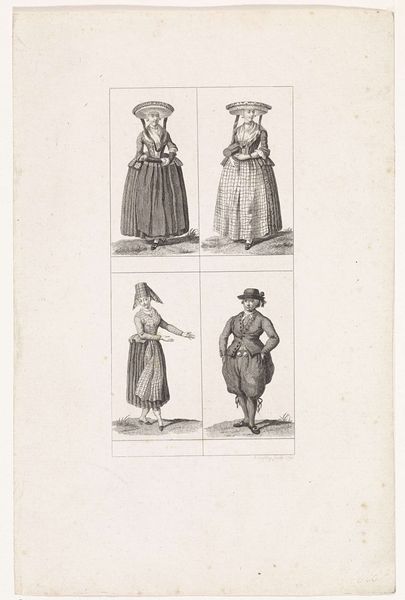
Vier figuren in Hollandse klederdracht
Daniël Vrijdag
1765 - 1765Location
RijksmuseumListen to curator's interpretation
Curatorial notes
Curator: It feels like peering through a very delicate time portal, doesn’t it? All that fine line work—so precise! Editor: Indeed. We are looking at "Vier figuren in Hollandse klederdracht," which translates to "Four Figures in Dutch Traditional Costume," dating back to 1791. It is a print by Daniël Vrijdag. Curator: Costume! That explains why each figure is presented so meticulously, almost like specimens in a botanical drawing. They each occupy their own little frame, isolated yet interconnected. What were your initial thoughts? Editor: I was struck by the rigidity and formality. There’s a real emphasis on surface and pattern, wouldn’t you say? The engraving style enhances that almost ethnographic approach. Curator: Right? They’re not just people; they’re representatives of something larger—perhaps the regional diversity of Dutch culture, frozen in time. The outfits, each incredibly detailed, are the story themselves. The puffed sleeves on the one woman compared with the man in loose breeches are striking, like he's just stepped off a ship, perhaps. Editor: Precisely! The structural framework of the composition, with its neat quadrants, underscores this impulse to categorize and classify. Note how Vrijdag employs line and form to describe the differing textures, and his technical skill manages to provide weight and presence despite its rather slight character. It evokes ideas concerning history, class, and identity—all communicated through the semiotics of dress. Curator: But think, too, about the human hand in all that meticulousness. Someone labored over each line, imbuing it with a particular energy. It is both distant and remarkably intimate because I can still see, in some ways, something of myself and my relationship with identity there. It also has a beautiful clarity that pulls you closer, I think. Editor: I appreciate how you balance the personal with the critical there. On that note, what do you make of the rather muted, almost austere palette? It strikes me that the monochrome emphasizes an inherent seriousness of intent. Curator: I completely agree that its austere color directs one's full attention to scrutinizing textures and form, yet within this limitation, Vrijdag found creative opportunity to present both pattern and form in subtle tension to achieve clarity in representing each distinct subject. I keep thinking about what they must've thought being sketched like this and I cannot help but see my ancestors when I look at their stern faces, I imagine a long day of wearing heavy, stiff clothes was exhausting. I hope it made them proud. Editor: A rich array of avenues we’ve unearthed here, connecting art, culture, and perhaps a glimpse of humanity from over two centuries past!