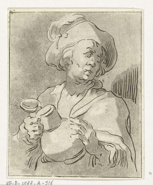
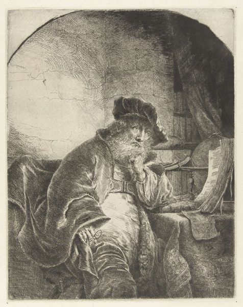
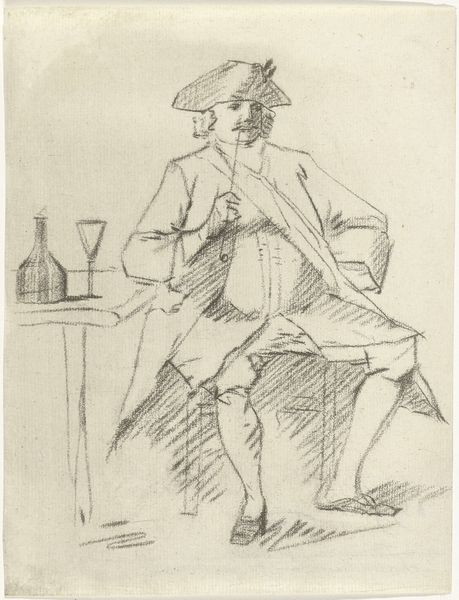
portrait
baroque
portrait drawing
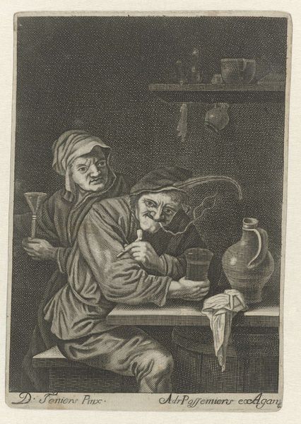
genre-painting
Dimensions: height 153 mm, width 129 mm
Copyright: Rijks Museum: Open Domain
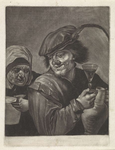
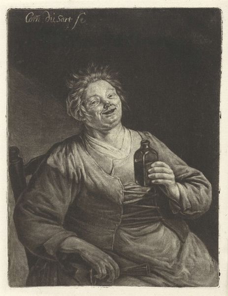
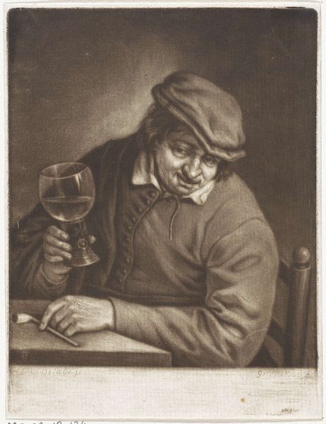
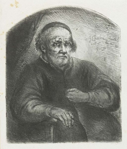
Editor: We're now looking at "Smaak," a print made by Cornelis Dusart between 1679 and 1704. It's currently held at the Rijksmuseum. The subject's exaggerated expression and the contrasting textures of his robes and the wine glass give it a unique, almost comical feel. How do you approach interpreting this work? Curator: Formally, I'm drawn to the stark contrasts and the manipulation of light and shadow to create depth and volume. Notice how Dusart employs hatching and cross-hatching techniques. It gives the piece an almost sculptural quality, wouldn't you agree? Consider, also, the dynamic composition. The figure is off-center, yet balanced by the objects on the barrel, drawing the eye through the various planes of the image. Editor: Yes, I see that. The way the light catches on the glass is particularly effective. Curator: Precisely! The glass becomes almost a focal point, contrasting with the earthy tones and textures of the figure's clothing and the wooden barrel. Observe how this visual tension contributes to the overall sense of dynamic movement. And what do you think of the negative space in the upper right corner? Editor: It feels a bit empty, but maybe it helps emphasize the figure's isolation? Curator: Perhaps. Or consider it as a compositional tool that contributes to the asymmetrical balance of the print. It allows our eye to rest, before being drawn back to the detailed rendering of the figure and still life. It prevents the image from feeling too cluttered, enabling the viewer to concentrate on the intrinsic form. Editor: I hadn't thought of it that way. Thanks, seeing the balance within asymmetry really changed my perspective. Curator: Indeed. By looking closely at form, line, texture and their relation, we unlock an avenue for aesthetic appreciation and meaningful exchange with artwork, time and time again.
Comments
No comments
Be the first to comment and join the conversation on the ultimate creative platform.