Copyright: Tony DeLap,Fair Use
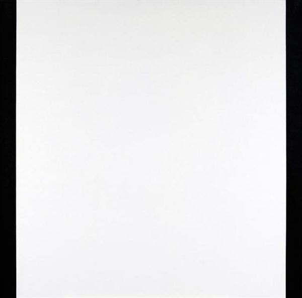
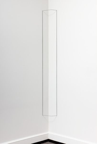
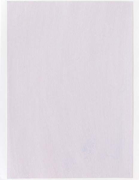
Tony DeLap made "The Whim of Tituba", maybe in the last few years, and I love how it plays with our sense of space. The color is kept to a minimum: white and black and the emphasis is on form. It reminds me of some of my own stuff, actually. The surface is matte and smooth, giving it a clean, almost industrial feel. Look at the way the black square pops out; it's not just painted on, it feels like it's part of the structure itself, an illusion, an optical 'whim'. It’s as if DeLap is asking, “What is the space of painting?” The overall effect is like a minimalist stage set, it's so economical, so reduced, and that gives it a kind of a punch. I'm reminded of Sol LeWitt, who was similarly interested in the intersection between 2D and 3D space, but DeLap is also in his own territory. It's a reminder that in art, as in life, things aren't always as they seem.
Comments
No comments
Be the first to comment and join the conversation on the ultimate creative platform.
More like this