drawing, paper
drawing
paper
Dimensions: overall: 24 x 35.7 cm (9 7/16 x 14 1/16 in.)
Copyright: National Gallery of Art: CC0 1.0
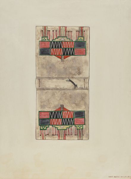
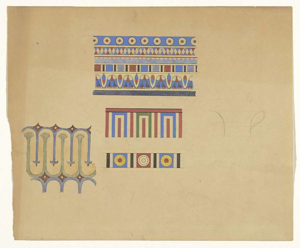
This Parchment Book Cover was made by Robert W.R. Taylor, sometime before 1995, using what looks like watercolor. You can see it's all about process, the layering of color, the way the marks build up to create a sense of depth. It's interesting how the texture of the parchment affects the way the watercolor sits on the surface. Taylor's use of color is pretty cool, with those muted tones creating a dream-like quality. Look at the stylized figures, those stacked registers of marks, the way he divides the picture plane. It's almost like a visual language. There’s something really intimate and personal about the way Taylor handles the medium, the kind of thing you can only learn from spending hours and hours alone in the studio playing around with different tools and techniques. The overall effect is of something ancient and timeless, something that speaks to the enduring power of art to communicate across cultures and generations. I'm reminded of Hilma af Klint, with her symbolic use of color. But really, Taylor is in his own world. His images celebrate ambiguity, multiple interpretations, and the never-ending conversation that is art.
Comments
No comments
Be the first to comment and join the conversation on the ultimate creative platform.