drawing, paper, ink, indian-ink
#
17_20th-century
#
landscape illustration sketch
#
drawing
#
ink drawing
#
pen sketch
#
pencil sketch
#
landscape
#
paper
#
ink
#
german
#
pencil drawing
#
ink drawing experimentation
#
indian-ink
#
pen-ink sketch
#
surrealism
#
watercolour illustration
#
pencil art
Copyright: Public Domain
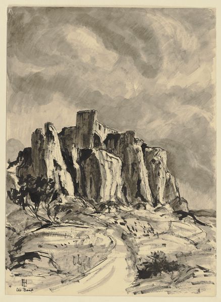
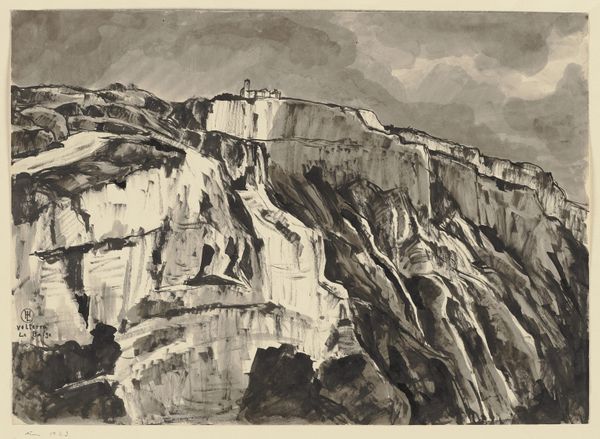
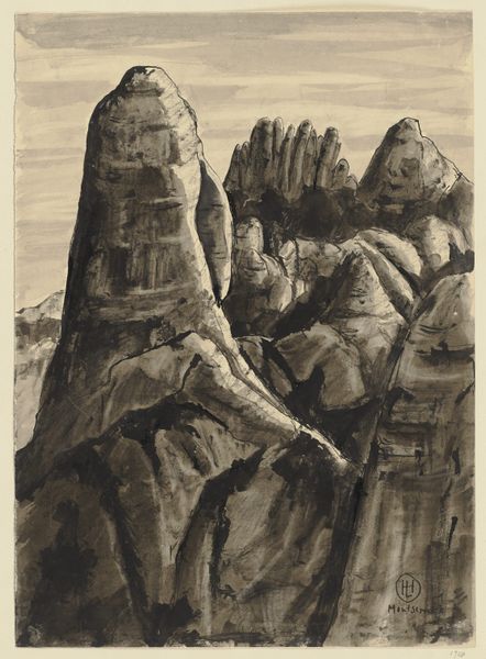
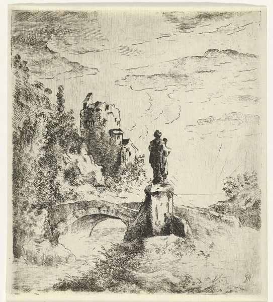
Curator: So, let's spend a moment with Hermann Lismann's depiction of "Der Roque Nublo auf Gran Canaria". The artwork, held here at the Städel Museum, is a drawing utilizing ink and pencil on paper. Editor: My first thought? Stark. It's this landscape, but filtered through such a limited palette. The contrast between the near-black ink and the paper is really hitting me. It feels raw, almost like an etching, even though it's ink and pencil. Curator: It does evoke that sort of direct, almost visceral reaction, doesn't it? When you look at Lismann's process, it's evident in the furious, almost frantic lines, creating both form and shadow with simple, economic gesture. Think about the labor involved—each stroke is a deliberate act, contributing to the overall scene. No paint layering here to finesse and rework. Editor: Absolutely. And you really get a sense of the materiality. You can almost feel the roughness of the paper, see the way the ink bleeds into it. It feels honest in a way that slicker mediums often don't. There's this dance of light and shadow created by this material conversation between ink, pencil, and paper. Curator: Exactly, there’s this wonderful energy to it—it’s not merely representational. He captures a place, but more importantly, he evokes a feeling, right? The Roque Nublo becomes less about a geographical landmark and more about this towering, almost spiritual presence in the landscape. Editor: Definitely. It feels symbolic, almost primal. And I wonder, how much did the limitations—or the affordances—of the materials guide him? He builds texture and depth through hatching and cross-hatching. His choices of line weights really describe those forms of the rocks so we can sense their weight and volume, despite their two-dimensionality. It's fascinating how much information is conveyed with so little. Curator: It leaves us with much to consider, doesn't it? A reminder that profound expression can emerge from the most basic means. Editor: Yeah. Looking at this, you realize the true artistry is not about flashy colors, it is about the simple ways you can let the materials talk back to you, to speak their truths as you manipulate them.
Comments
No comments
Be the first to comment and join the conversation on the ultimate creative platform.
More like this