drawing, ink, pen
portrait
drawing
pen sketch
figuration
ink
romanticism
pen work
sketchbook drawing
pen
history-painting
academic-art
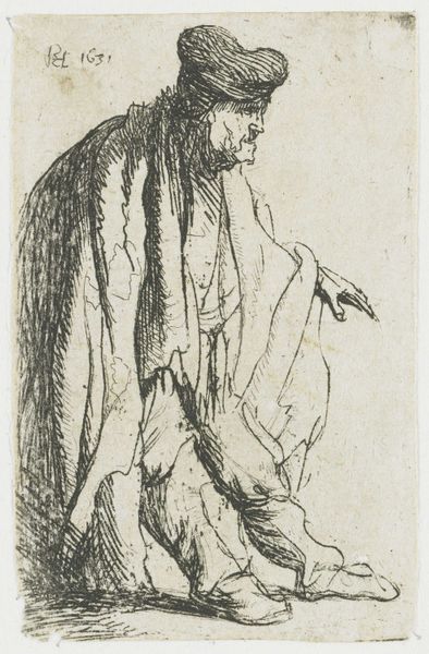
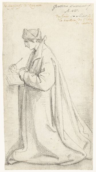
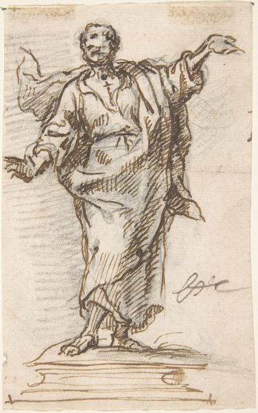
Dimensions: height 140 mm, width 78 mm
Copyright: Rijks Museum: Open Domain
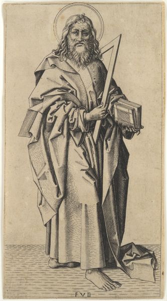
Editor: Here we have "Standing, Writing Man" by David-Pierre Giottino Humbert de Superville, sometime between 1780 and 1849, at the Rijksmuseum. It's an ink drawing that reminds me of quick, casual sketches. What catches your eye about this work? Curator: Note the deliberate use of line in this sketch. Observe how the hatching creates volume in the figure's cloak, contrasting with the relative sparseness defining the face and hands. Does this linearity suggest anything to you about the artist’s intentions, its semiotics? Editor: I see that, the cloak is almost overpowering in its detail compared to the face. Is it simply about focusing on the texture and drape of the fabric? Curator: Perhaps. Consider the composition as a series of contrasting forms. The rigid lines of the writing desk oppose the flowing curves of the man’s posture. The geometric pattern in the clothing contrasts with the more organic feel of the face, and the shadow work pooling down in the man's cloak contrasts with the relative flat space of the backdrop. It's through the tension of the form that Humbert de Superville communicates something greater. Editor: So it's less about the "what" and more about the "how." How the different visual elements play off each other. Curator: Precisely. It's a structural interplay, a visual dialogue that supersedes mere representation. What the image represents takes a backseat to the image's structural components. Editor: That’s fascinating. I usually focus on subject matter first, but I see how analyzing the visual language itself reveals so much more. Curator: Indeed. Formal analysis provides a powerful lens through which to understand art. We're often taught what to think and this exercise shows us how to think.
Comments
No comments
Be the first to comment and join the conversation on the ultimate creative platform.