drawing, ink, pen
#
portrait
#
drawing
#
ink drawing
#
pen illustration
#
pen sketch
#
ink
#
pen
Copyright: Rijks Museum: Open Domain
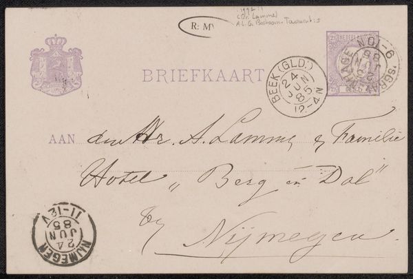
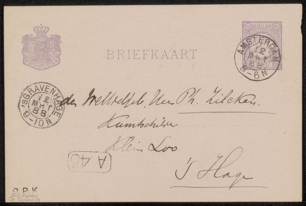
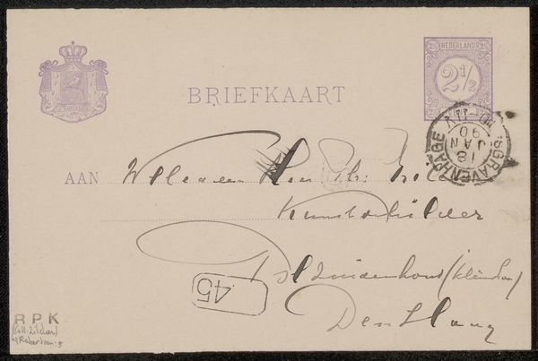
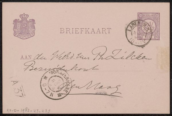
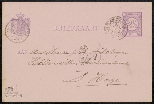
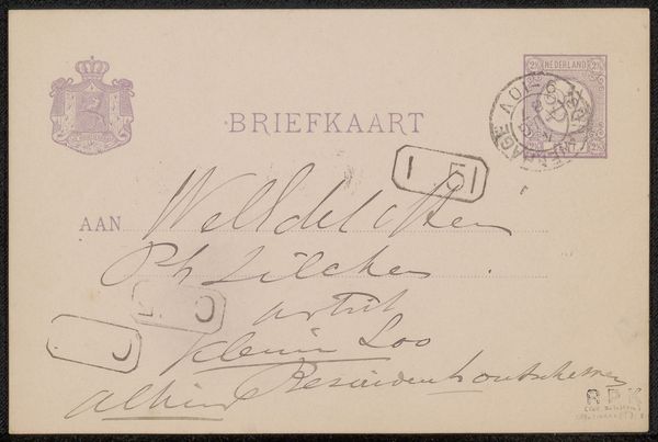
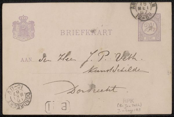
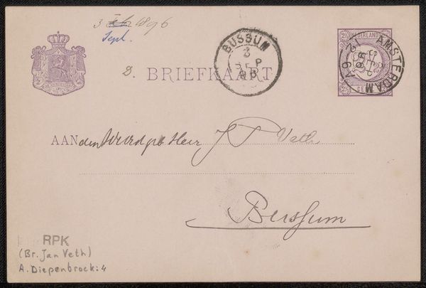
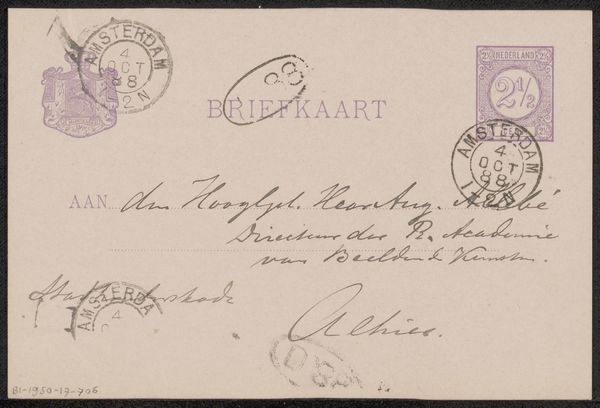
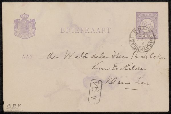
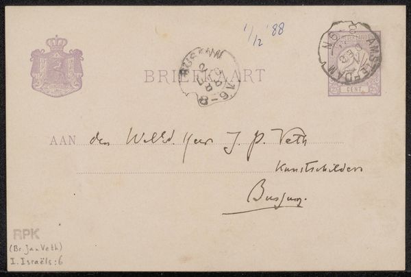
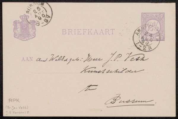
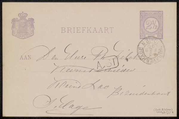
Editor: This is "Briefkaart aan Jan Veth," potentially created between 1895 and 1899 by Jacob Pieter Moltzer. It’s an ink and pen drawing on what seems to be a postcard. The aged paper and delicate script create a tangible sense of the past. I’m intrigued by the formal arrangement of stamps and the careful handwriting. What compositional elements stand out to you? Curator: Note how the epistolary shapes its intrinsic form. We observe the rectangle, neatly segmented by imagined horizontal axes implied for address writing, and adorned with meticulously placed stamps, themselves repeating the circular motif and thus echoing across the field. Consider how the visual weight is carefully distributed, the stamps acting as visual anchors in the top corners, balancing the text below. Editor: So, the stamps and text aren’t just utilitarian, they actively contribute to the overall design? Curator: Precisely. The variation in ink tone and line weight create visual hierarchies, guiding the viewer’s eye. Observe the confident strokes versus the feathery lines—each mark contributes to the tactile quality. How does this interplay affect your interpretation of the overall image? Editor: I see how it elevates the postcard beyond a simple message carrier into a carefully constructed visual object, where even the imperfections of the ink and paper become part of the artwork’s aesthetic qualities. I had never considered a postcard in such detail! Curator: And therein lies the beauty; that something so functional also possesses such refined design principles. Approaching ordinary materials through a Formalist lens truly transforms how we can interpret any given work.
Comments
No comments
Be the first to comment and join the conversation on the ultimate creative platform.
More like this