Copyright: Blinky Palermo,Fair Use
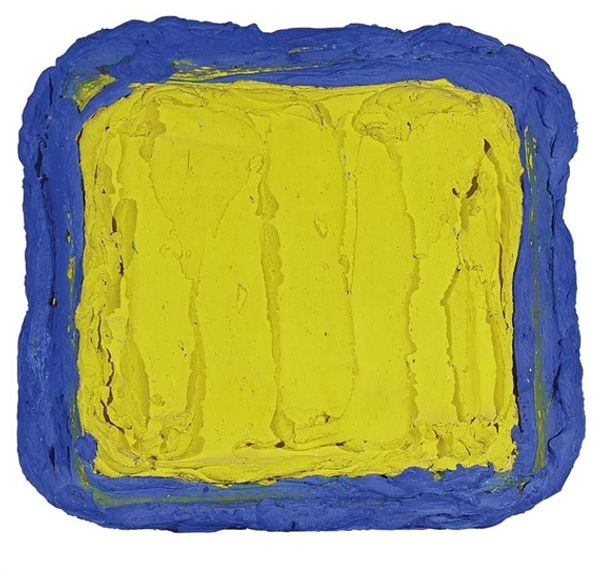
Editor: Here we have Blinky Palermo's "Blau auf Grün," created in 1965 using acrylic paint. I'm struck by how this abstract work, just two blocks of color really, manages to feel both calming and a little unsettling at the same time. What do you see in this piece? Curator: I see a profound engagement with the socio-political landscape of post-war Germany. Palermo, as a student of Joseph Beuys, was deeply invested in exploring new languages for art after the collapse of traditional values. The simplicity, the near-rejection of form, speaks to a desire to rebuild a visual vocabulary from scratch, divorced from the nationalist aesthetics that preceded it. Do you notice the deliberate lack of narrative, how it avoids easy interpretation? Editor: I do, it almost feels resistant to easy meaning. Was that intentional? Curator: Absolutely. Palermo challenges the viewer. This wasn’t art for the elite, but a democratizing gesture. By stripping away overt symbolism and embracing abstraction, he invites everyone to project their own experiences onto the work. Blue and green – what do these colors mean to *you* in the context of a nation grappling with its identity? Does it echo environmental concerns, given the rising ecological movements of the time? Editor: That's a perspective I hadn’t considered. I was focused more on the formal qualities. Curator: And that’s valid, but understanding the social undercurrents enhances our understanding. Think of it as a visual manifesto, a quiet rebellion against established norms. By abstaining from historical grand narratives, it urges us to participate in building a more inclusive present. Editor: This makes me rethink abstraction; it's not just about the aesthetics. It's embedded in social issues too! Curator: Exactly. Palermo makes us look at the world, and our place in it, differently. He provokes new interpretations based on an experience which we, as individuals, carry inside.
Comments
No comments
Be the first to comment and join the conversation on the ultimate creative platform.
More like this