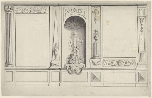
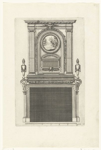
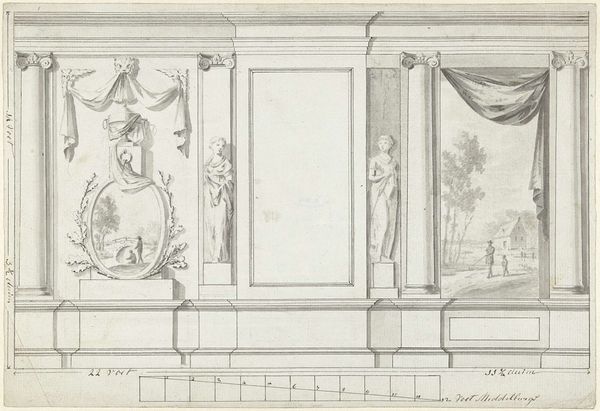
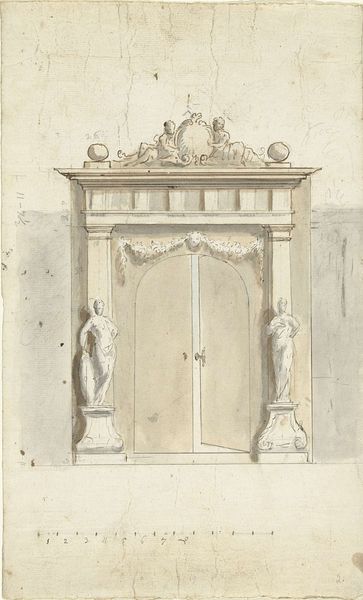
Ontwerp voor kamerversiering met drie panelen met boven de schoorsteenmantel een staande figuur 1767 - 1823
drawing, paper, pencil, architecture
drawing
neoclacissism
figuration
paper
form
pencil
line
architecture
Dimensions: height 170 mm, width 375 mm
Copyright: Rijks Museum: Open Domain
Editor: This is "Ontwerp voor kamerversiering met drie panelen met boven de schoorsteenmantel een staande figuur", or Design for a room decoration with three panels and a standing figure above the mantelpiece, created between 1767 and 1823 by Abraham Meertens. It’s a pencil drawing on paper, showcasing a neoclassical style. It's so orderly! I wonder about its social significance? What can you tell me about the intended audience and the role of interior design like this in society back then? Curator: Well, the late 18th and early 19th centuries witnessed the rise of Neoclassicism, reflecting a broader societal fascination with the perceived order and virtue of ancient Greece and Rome. Room decorations like these weren’t just aesthetic; they served as powerful displays of wealth, taste, and education. The symmetrical design, the classical columns, the very presence of the figure above the mantel – likely a Roman deity or virtuous figure – would signal the owner’s alignment with Enlightenment ideals. Consider who could afford such detailed architectural designs. It speaks to an elite, keen on projecting a cultivated image. What do you make of the empty panels? Editor: They seem meant for artwork or mirrors, maybe to amplify the sense of space and luxury. Were such designs commonplace? Would many homes feature something like this? Curator: Only a select few would possess the means for bespoke designs like this. It reveals a society where interior design served a political function: to legitimize the power and status of the ruling classes through visual associations with historical power structures. It wasn’t simply about decoration; it was about establishing social hierarchies. Do you see how the precision of the lines contribute to that impression? Editor: I see that very clearly, and it suggests this served not just to make pretty walls, but to declare status. It’s fascinating how interior design can be such a strong social statement! Curator: Indeed. Studying pieces like this provides a valuable window into the cultural values and power dynamics of the past, far beyond aesthetics. We often consider public-facing art, yet private spaces were also crucial sites of cultural production and performance.
Comments
No comments
Be the first to comment and join the conversation on the ultimate creative platform.