Copyright: CC0 1.0
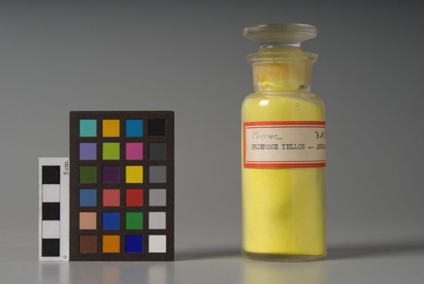
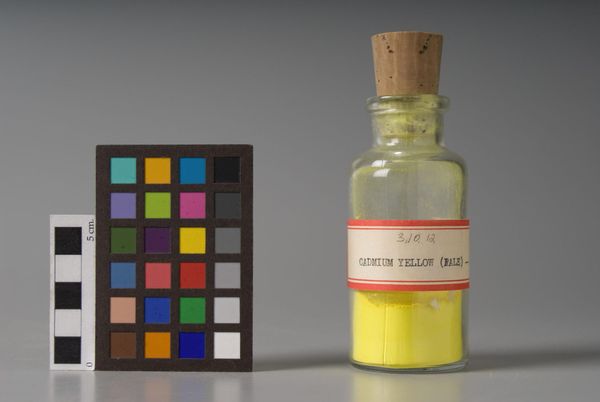
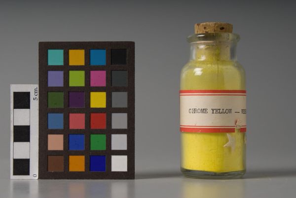
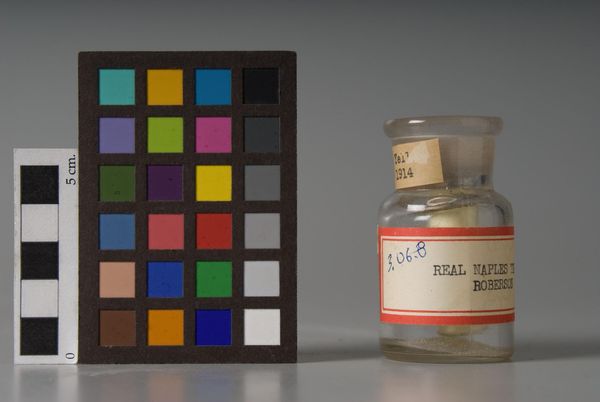
Editor: Here we have ‘Naples Yellow,’ by Le Franc. The color sample card is a strong contrast to the delicate yellow pigment. What do you see in this piece? Curator: The arrangement of the objects, with the color chart beside the pigment, creates a fascinating dialogue. The chromatic intensity of the pigment is amplified by the neutral backdrop. Editor: How does that affect our perception of the color itself? Curator: It isolates the hue, allowing for a purer engagement with the color's essence, its luminosity, and granular texture. The formal constraints highlight the very nature of Naples Yellow. Editor: That's a great perspective. Thanks for sharing your insights. Curator: My pleasure, I found this piece most intriguing, and the chance to discuss it with you has further clarified my understanding.
Comments
No comments
Be the first to comment and join the conversation on the ultimate creative platform.
More like this