Copyright: Public domain
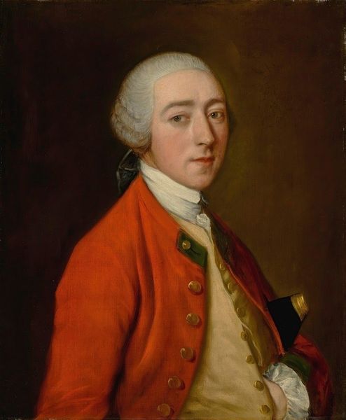
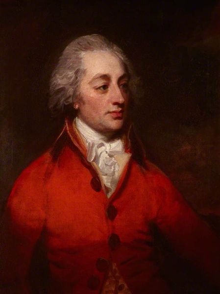
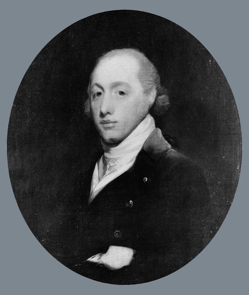
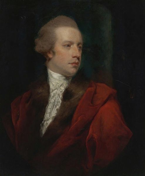
Editor: We're looking at "John Satterthwaite," an oil painting portrait from 1780 by George Romney. The first thing I notice is the strong contrast between the sitter's bright red coat and the dark background. What compositional elements stand out to you? Curator: Indeed, the chromatic interplay between the subject and the void is striking. However, more crucial is the precise triangulation formed by the white collar, face, and topmost button, a classical structural element guiding the viewer's gaze. Editor: It’s interesting you mention the geometry within the portrait. I was focused on the more immediate contrast of color. But is there any symbolism embedded in that bold red? Curator: While we cannot definitively assert authorial intent regarding overt symbolism, consider the formal qualities. The redness performs an undeniable function in defining space; observe how it flattens the picture plane, pushing the figure forward into the viewer's space. This generates a compelling tension against the recessive darkness. What sort of tension do you perceive there? Editor: Now that you mention the flatness, I see how the subtle gradations in his face and the coat's texture suggest volume while still feeling very contained. It creates a kind of dynamic restraint. I had initially viewed this work quite plainly but seeing this tension transforms it entirely. Curator: Precisely. Apprehending this interplay of flatness and depth enables us to decipher its formal syntax. By understanding formal elements, our appreciation moves beyond surface-level interpretation to a rich viewing experience.
Comments
No comments
Be the first to comment and join the conversation on the ultimate creative platform.
More like this