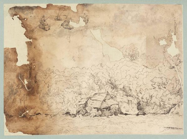
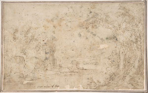
drawing, paper, ink
#
drawing
#
baroque
#
ink painting
#
landscape
#
paper
#
ink
#
genre-painting
#
mixed medium
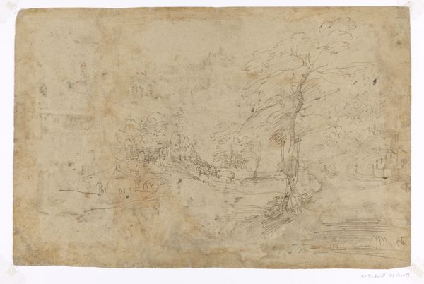
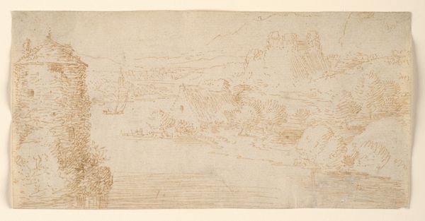
Dimensions: height 266 mm, width 419 mm
Copyright: Rijks Museum: Open Domain
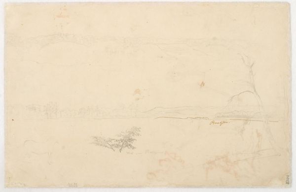
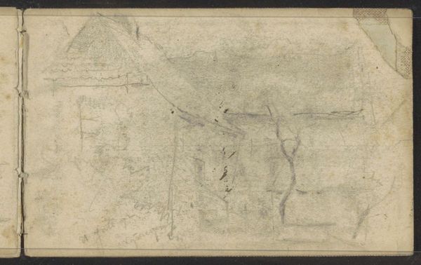
Curator: We're now viewing "Hertog van Bracciano bij het Lago di Bracciano," a drawing by Bartholomeus Breenbergh, created in the 1620s using ink on paper. What strikes you first? Editor: Its muted tonality gives it a very delicate, almost ethereal quality. I am particularly drawn to how Breenbergh balances the detailed foreground with the vast expanse of the lake. Curator: The medium itself – ink on paper – speaks volumes. Breenbergh’s choice wasn't arbitrary. Ink allowed for fine lines, hatching, and the creation of tonal depth that would have been challenging to achieve with other drawing media readily available at the time. Consider the accessibility of ink for a traveling artist sketching in the landscape; this choice affects its distribution to broader audiences through reproduced sketches and engravings. Editor: Absolutely. There’s a certain pragmatism inherent in this. But let’s consider the social aspect, too. The presence of figures, including perhaps the Duke himself, implies a leisure activity. The paper itself, its manufacture and trade, highlights the socio-economic framework that enables both the artist's travel and the aristocratic pursuit of landscape viewing as a past-time. Curator: True. The composition guides the eye using classical elements of Baroque landscapes such as strategic framing and strong contrasts, leading us toward what you said; an ethereal depth and perspective. It evokes a sense of cultivated serenity that serves the propaganda of aristocracy at the time. How much of it might reflect the labor and cost of acquiring such 'serenity', with laborers ensuring that the shores are suitable for the enjoyment of privileged class? Editor: Well put! I do agree. And how interesting that Breenbergh uses simple strokes of ink to depict that complex labor. What appeared simple on first viewing reveals layer after layer of social commentary in the materiality itself, thanks to your insights into its construction and display. Curator: Exactly. It shows that formalism has much to gain through social investigation. Editor: I completely agree! That being said, it's nice when the artwork speaks to its material origins and how its meaning relates to social class, even if unintentional.
Comments
No comments
Be the first to comment and join the conversation on the ultimate creative platform.
More like this